Learn a language abroad
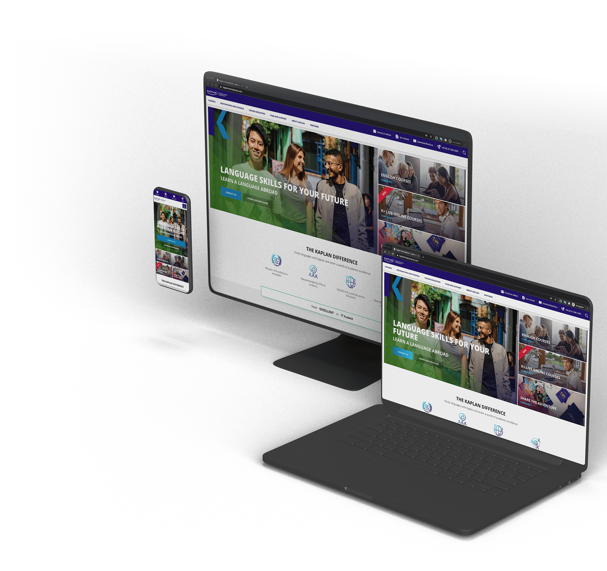
Kaplan International Languages is an education company that provides language education courses in schools in 9 countries around the world. As a world educational leader, Kaplan's top priority is providing high-quality language education. Kaplan has over 80 years of experience in helping students to achieve their personal and professional goals. Kaplan new digital applications will need to support this vision and provide suitable experiences for students who plan to study languages abroad.
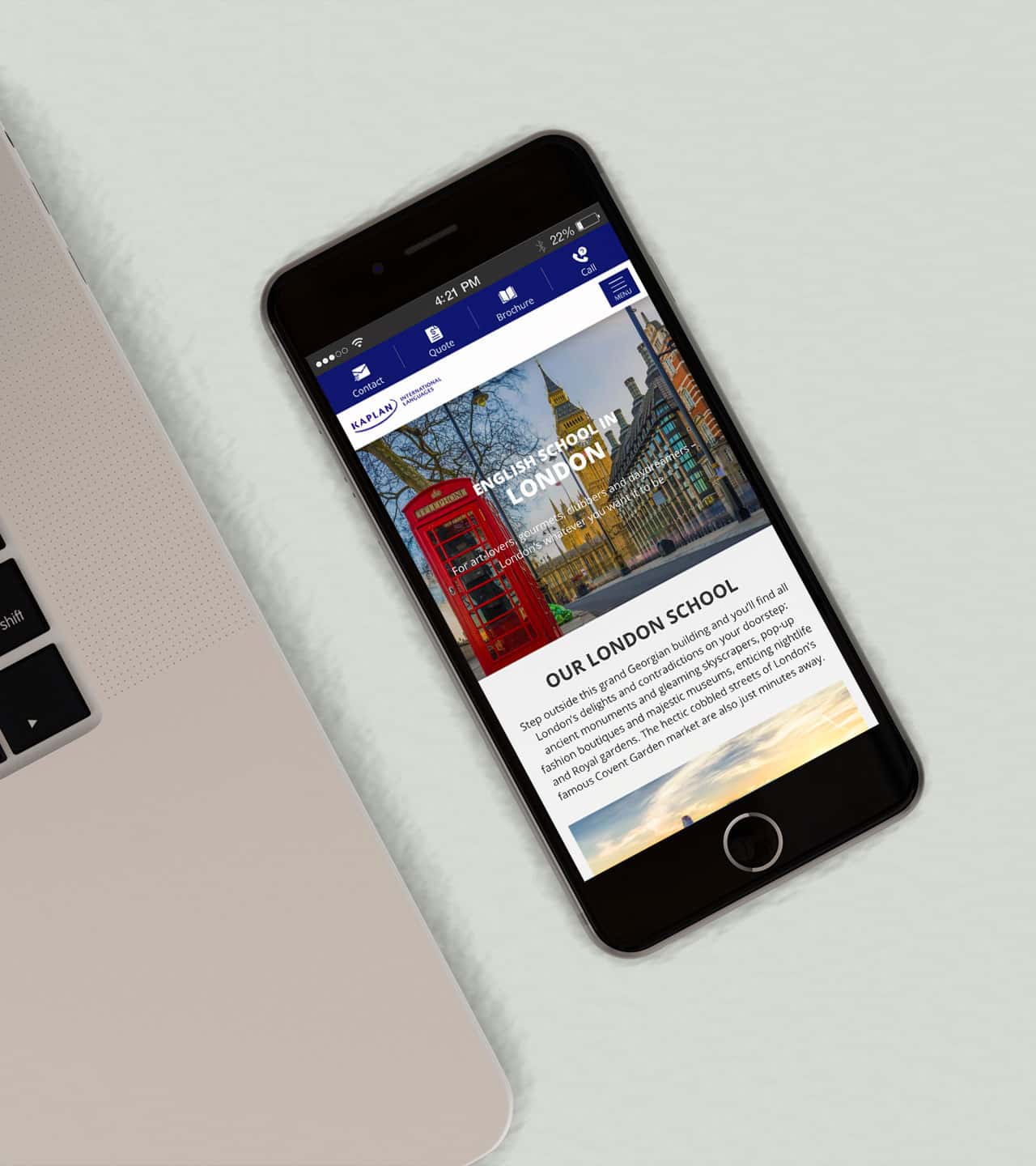
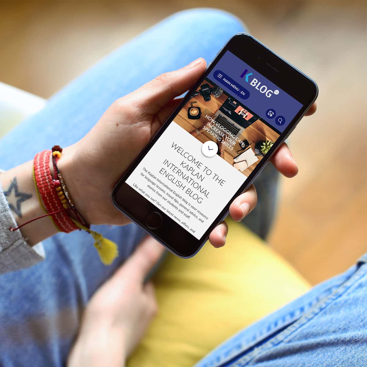
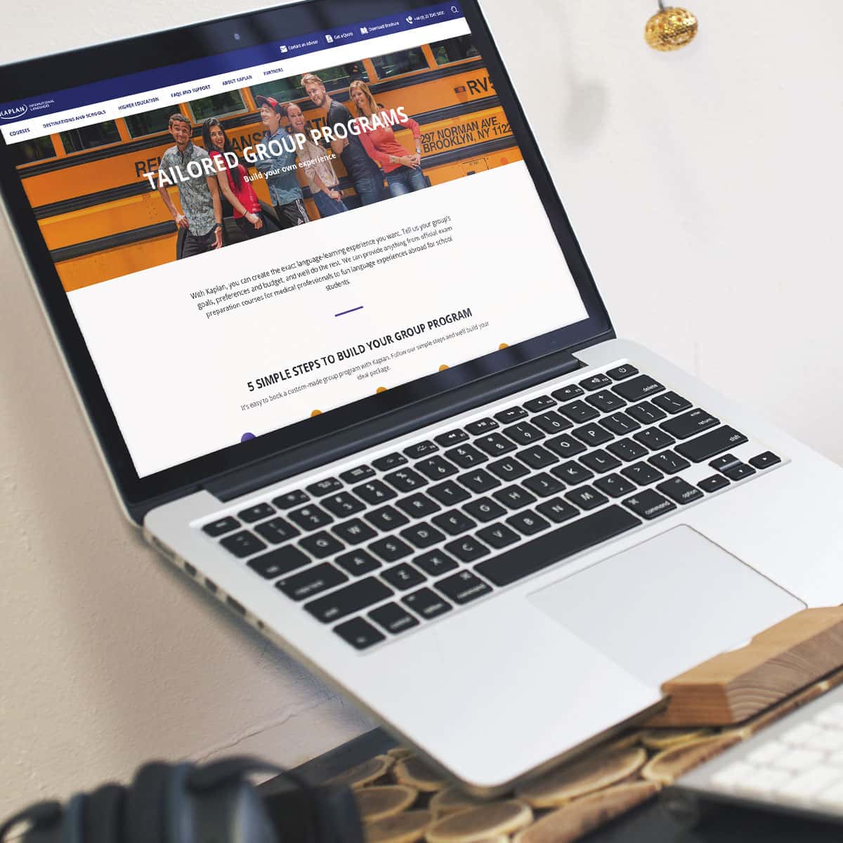
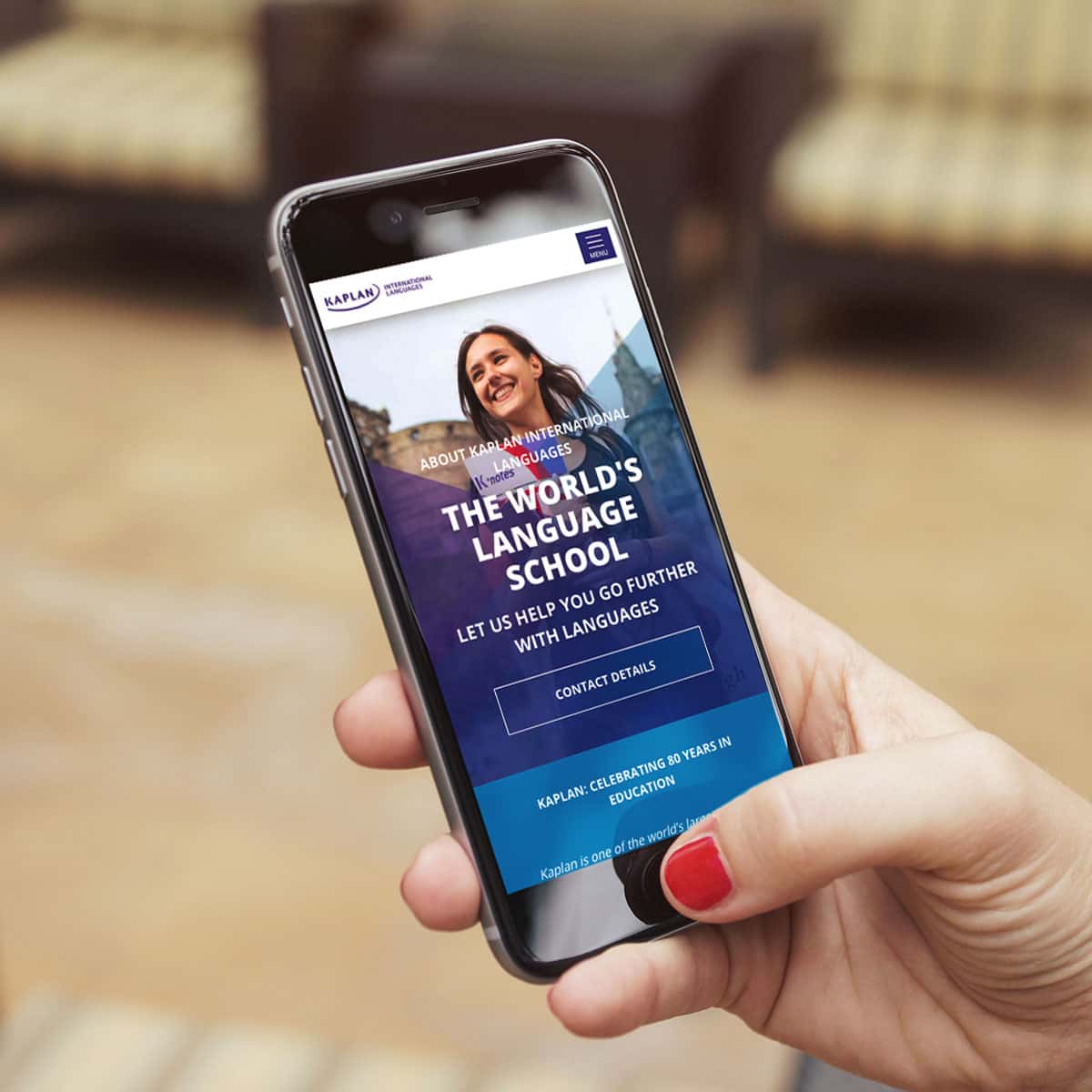
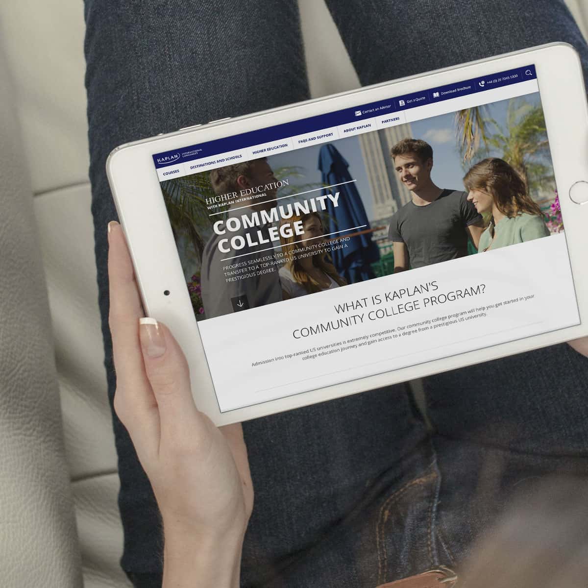
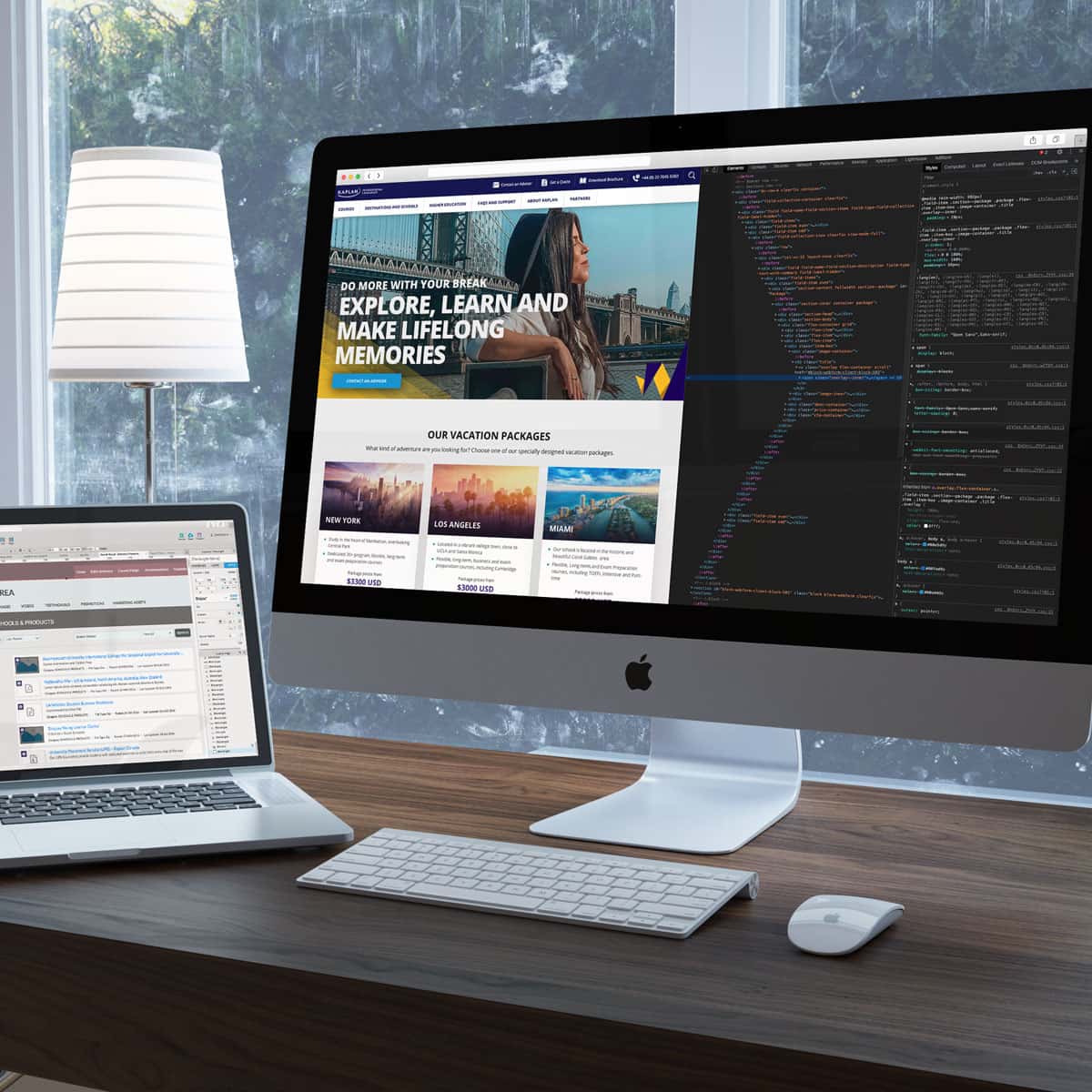
In 2014, Kaplan decided to develop a brand new website and mobile app. I led UX/UI design in this new project and widely covered all design steps such as wireframes, branding, visualisation and dynamic prototypes. Also I worked as a member of the dev team where I supported frontend development.
It was a big project where a product owner, UX experts, designers, developers and QA professionals participated over a year and a half. After the official launch, I carried out lots of useability tests and monitorings with UX and CRO professionals. We are continuing to evolve the application based on what we had found.
 My role
 Project period
August 2016 - October 2017 /v2
 Client
Get to the bottom line
Let me show you what my director, Martin said about the results after the new website launch.
"I’m delighted to be sharing some very good news. The new site is performing extremely well – much more strongly than the old one. All the key metrics – page views, bounce rate and conversion rate – have moved decisively in the right direction.
|
OLD
NEW
|
|
|---|---|
| Pages/Session |
1.78
3.97
|
| Conversion rate |
2.1%
5.5%
|
| Bounce rate |
76.7%
41.0%
|
Mission for new Kaplan website
Modern Look&Feel,
Simple and Easy,
User Friendly!
Clarify site’s Purpose and Goals
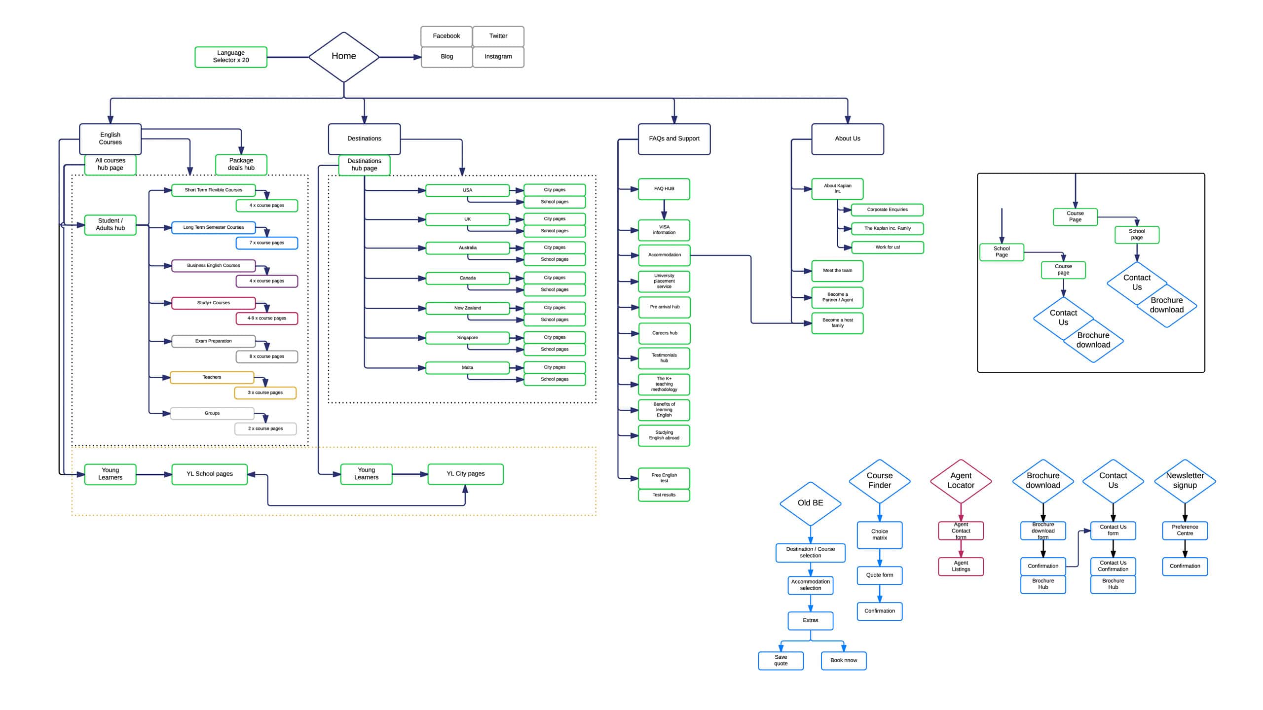
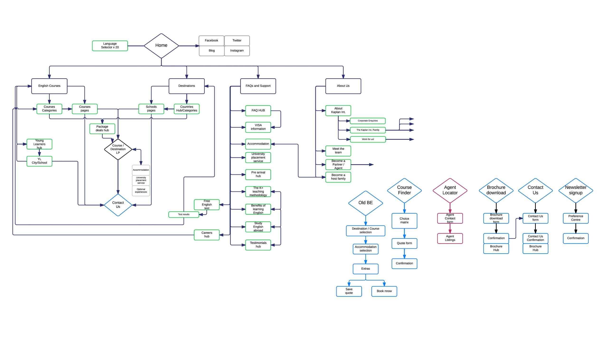
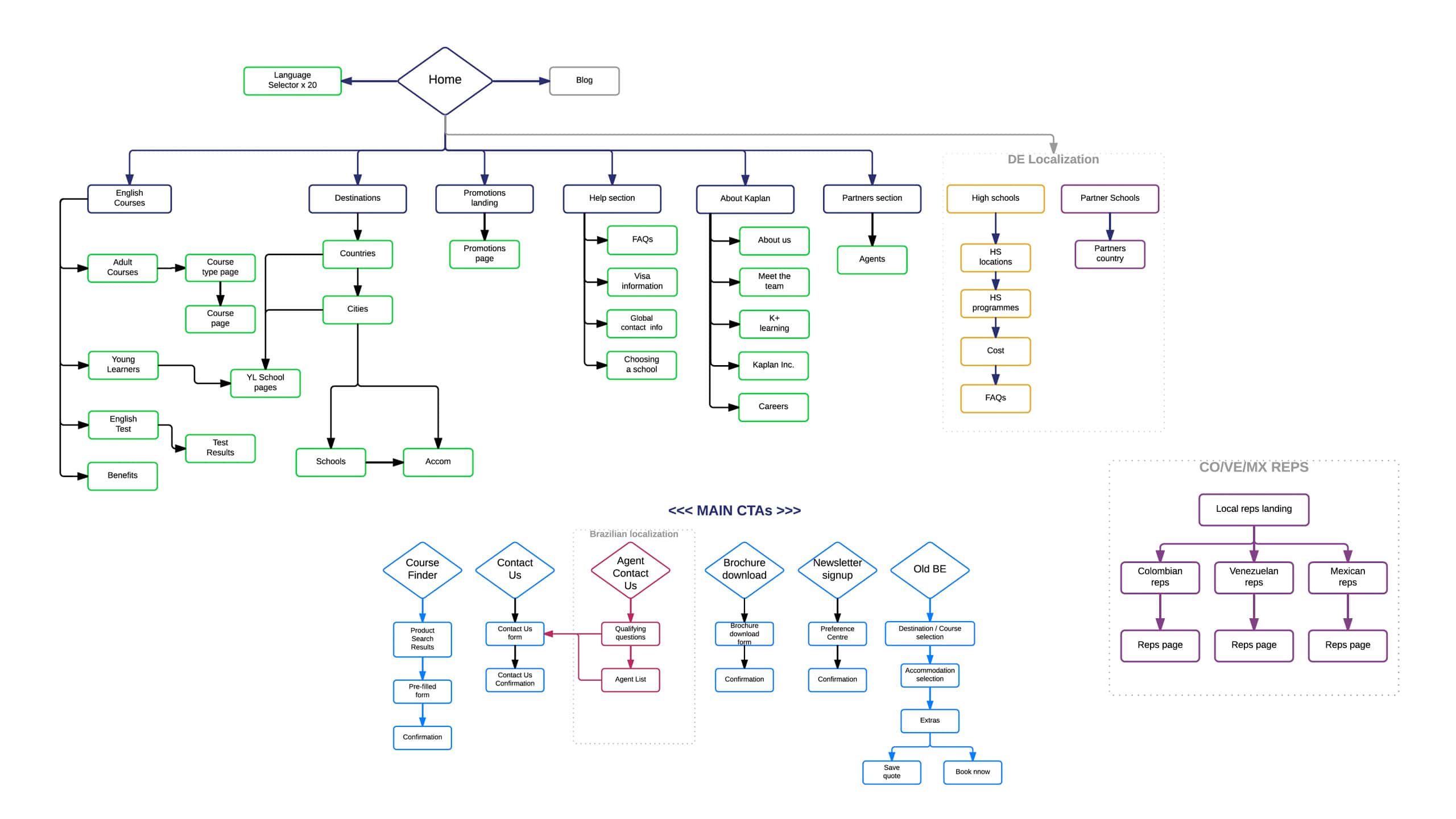
The site should contain not only legacy content but also new dynamic features such as Course finder, Quote tool and Booking system. We had to find a solution to keep our user journey simple in complex situation and it was important that user do not lose their journey while browsing. So We tried to minimise the number of steps required to complete their journey.
In addition to this, we needed to find the optimal balance between the business goals and user-friendly journey.
Wireframes
Failure teaches success and we never stopped
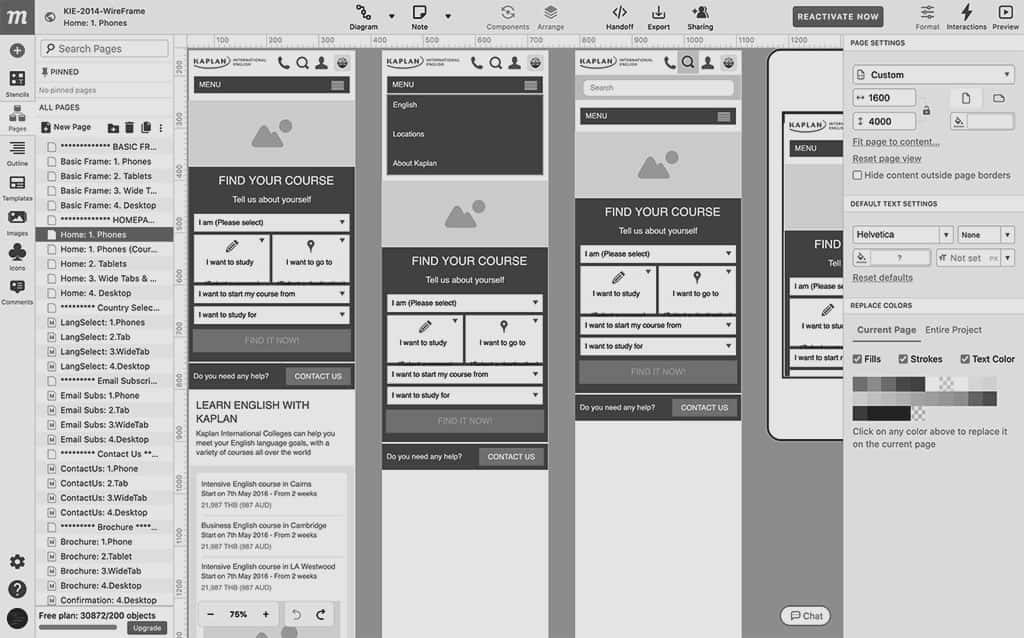
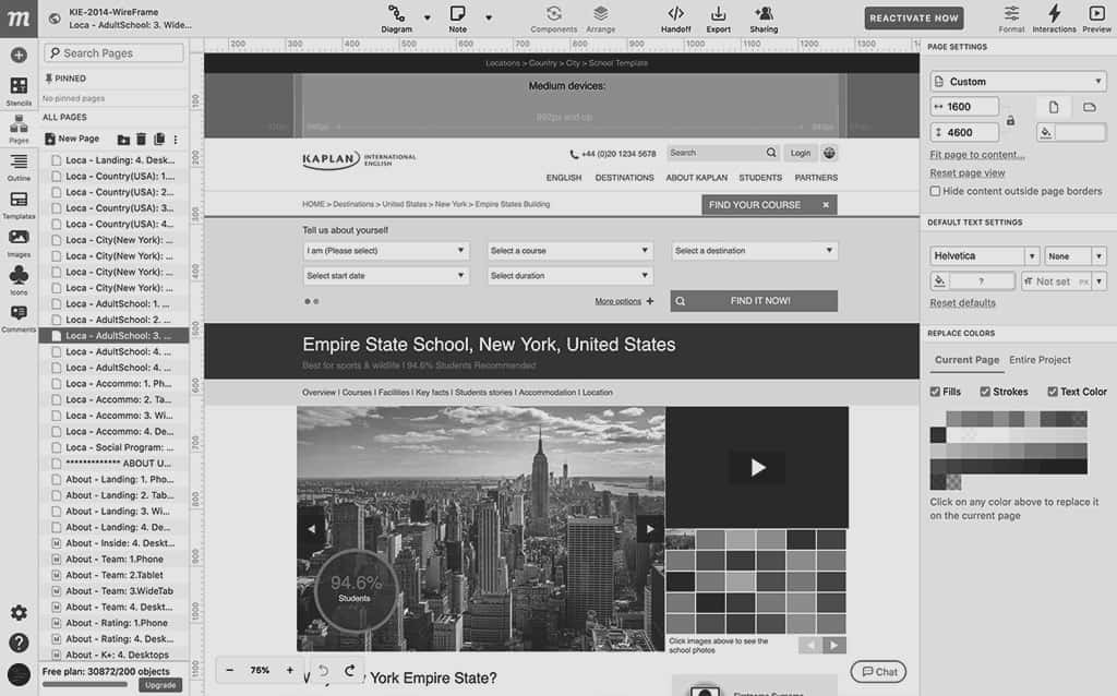
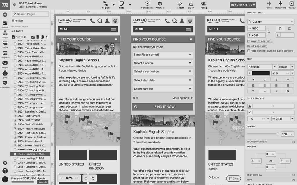
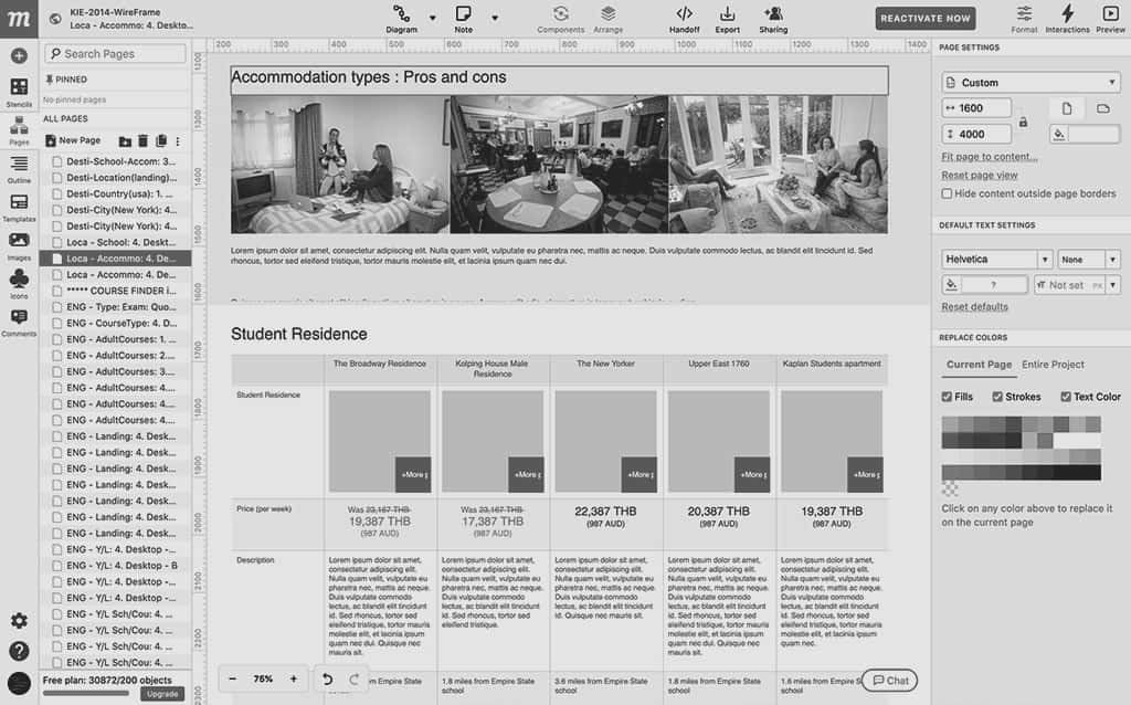
I defined all UX scenarios, grid system and responsive layout ideas in my wireframes and the first version was finally signed off. In the initial version, we planned to reinforce Course Finder for user to find what they want to get quickly. However, this design idea was dismissed after 1 year because we found out from our research that users prefer more to find our products by traditional browsing. We agreed to hold off the Course Finder until we find a solution for better usability.


·
·
·
·
·
&·
·
·
·
·
This is where we are now
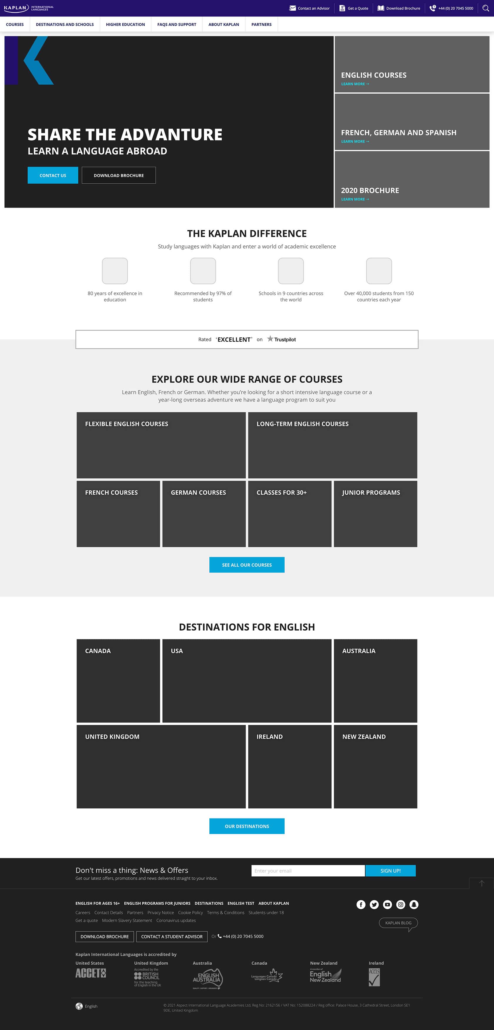
Through our constant research and analysis about our product, we created this optimised design layout, and it is still evolving.

Visual Hierarchy
I designed to make it easier for users to find our schools and courses by active deployment of key content at the top of the main screen, and at the same time placing Call-to-action buttons in the space where it requires high association and attention. This design plan resulted in increasing the conversion rates.
It continues to evolve through numerous usability tests
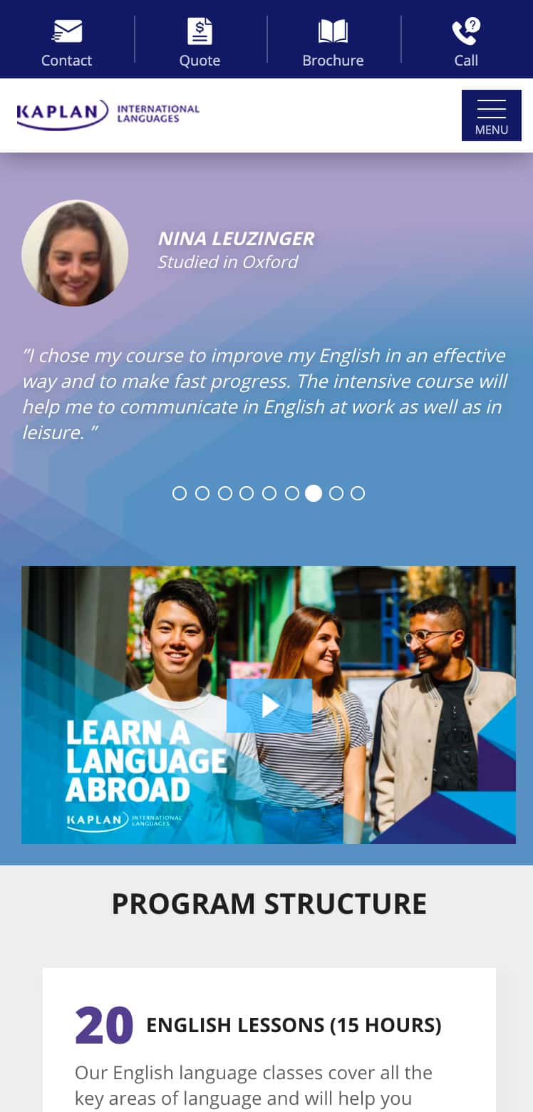
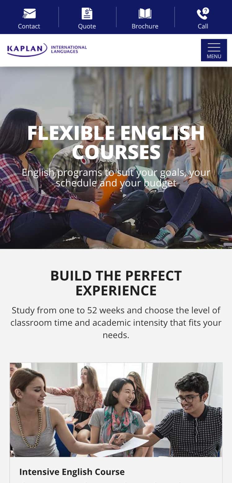
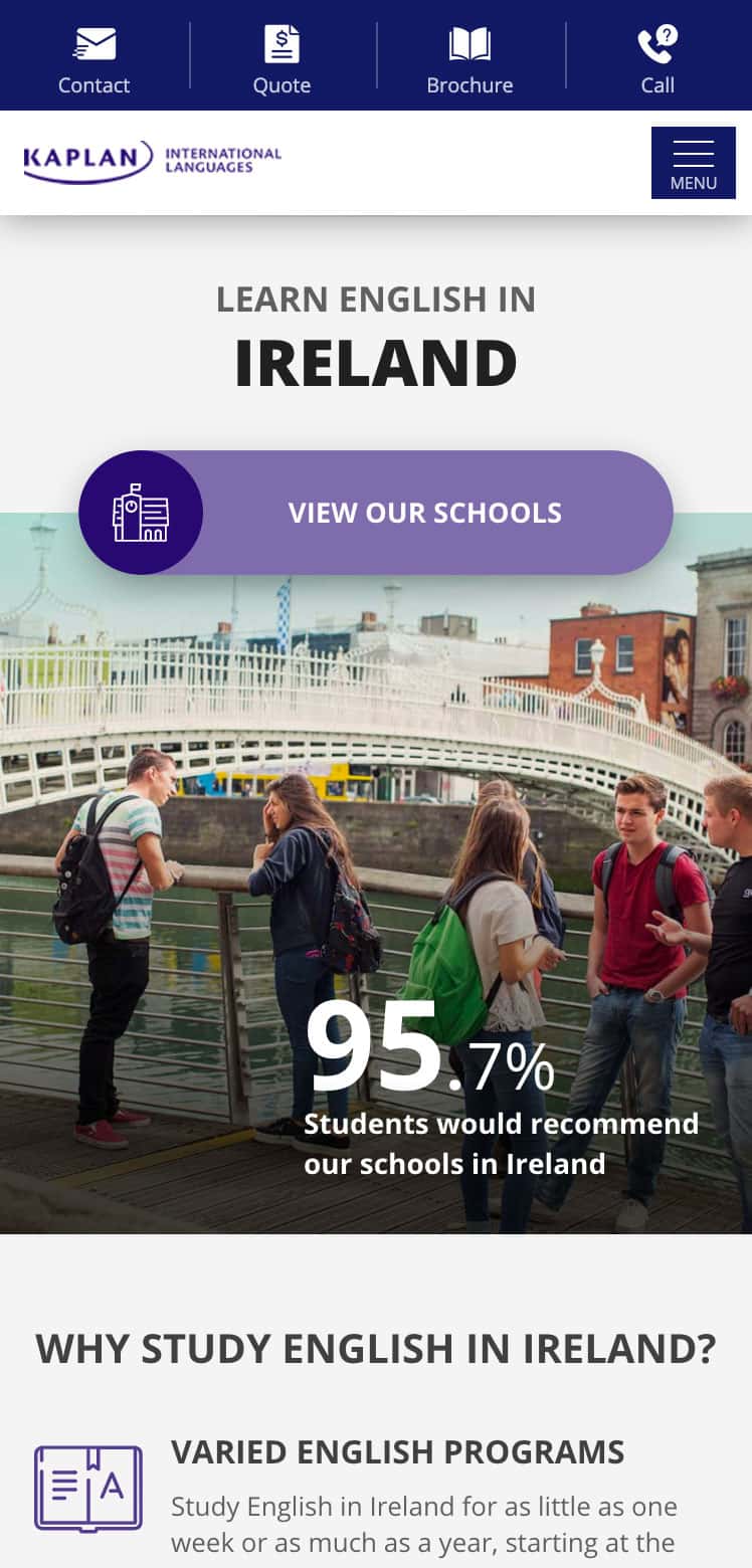
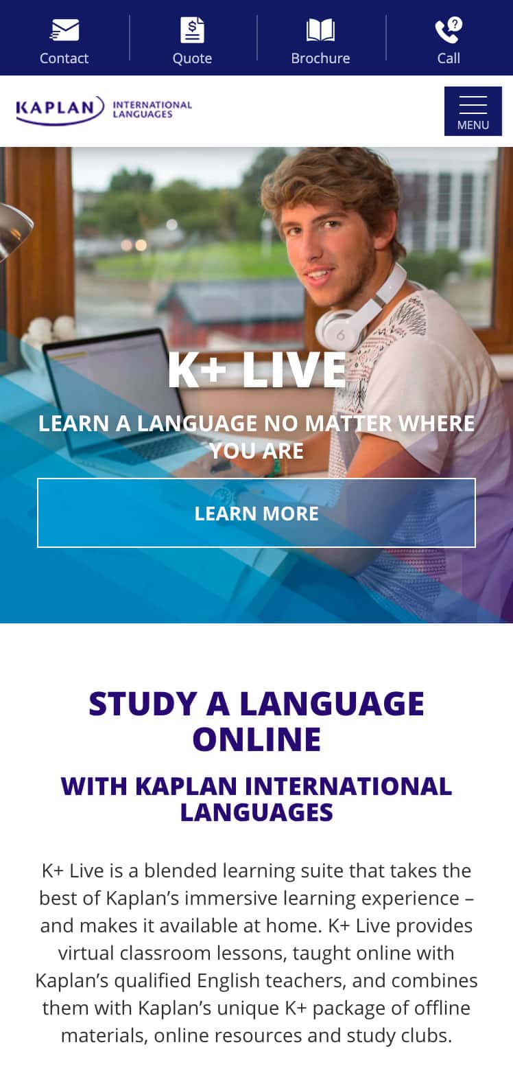
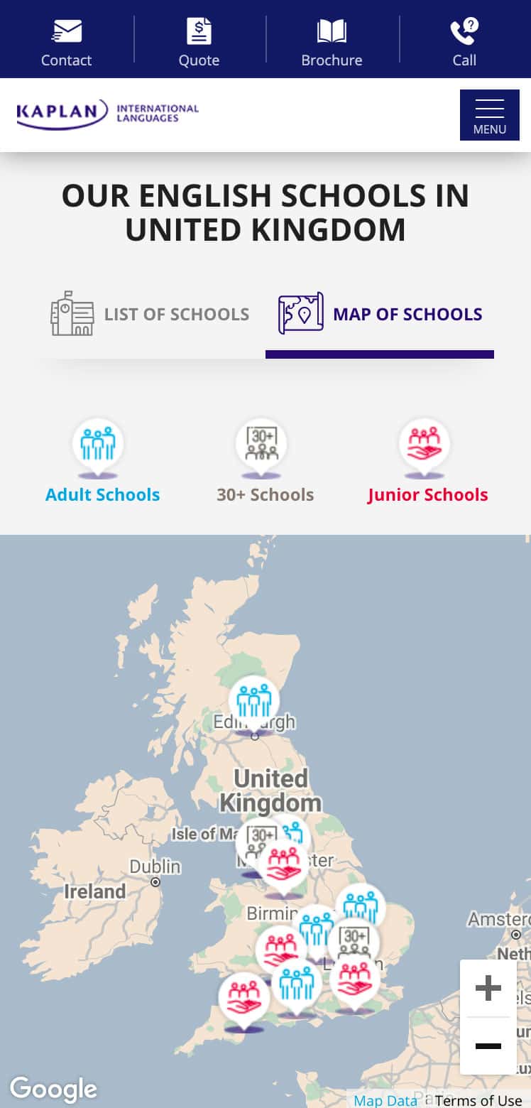
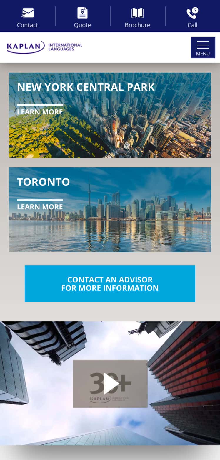
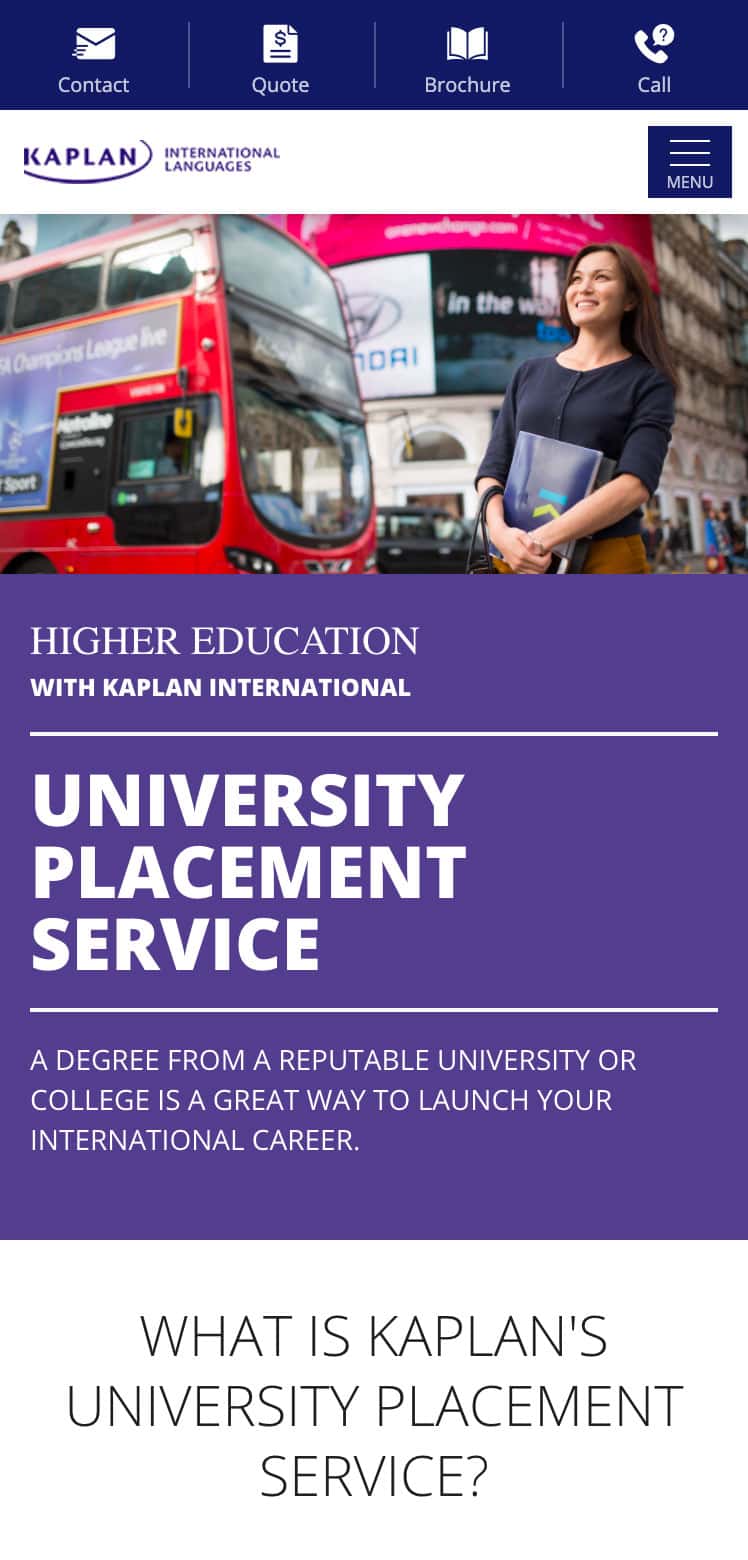
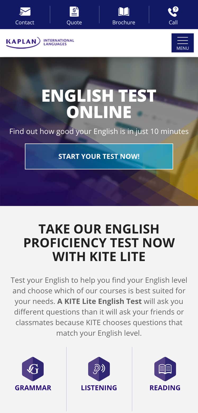
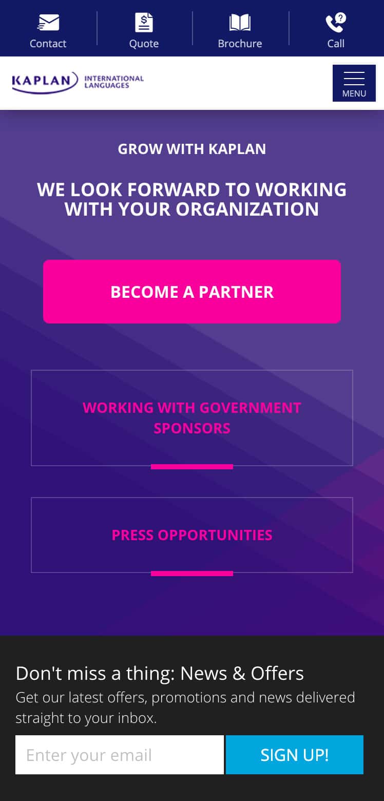
A brand new design to help our students go further Finalised UX/UI design examples




Get your quote
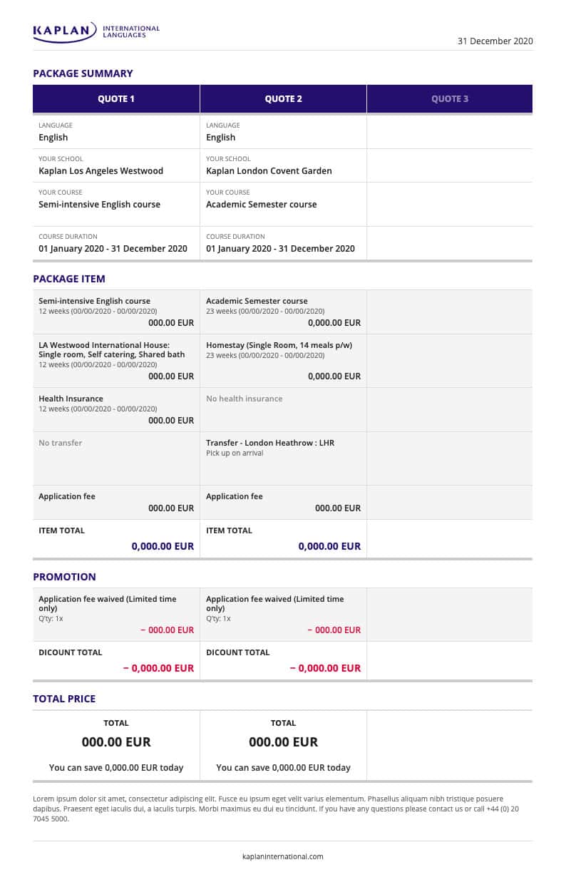
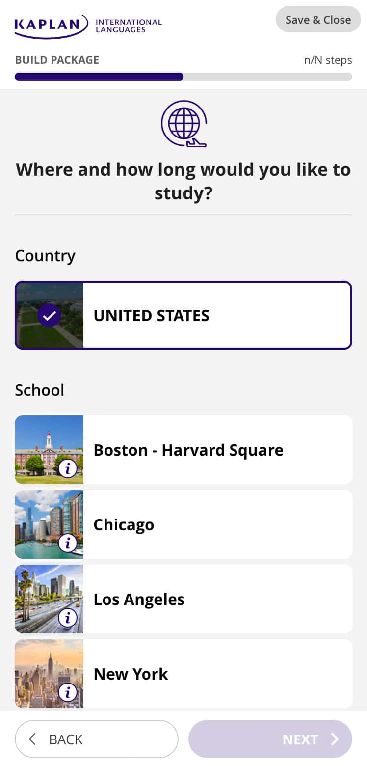
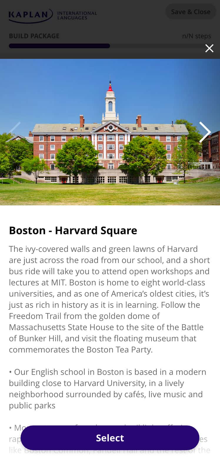
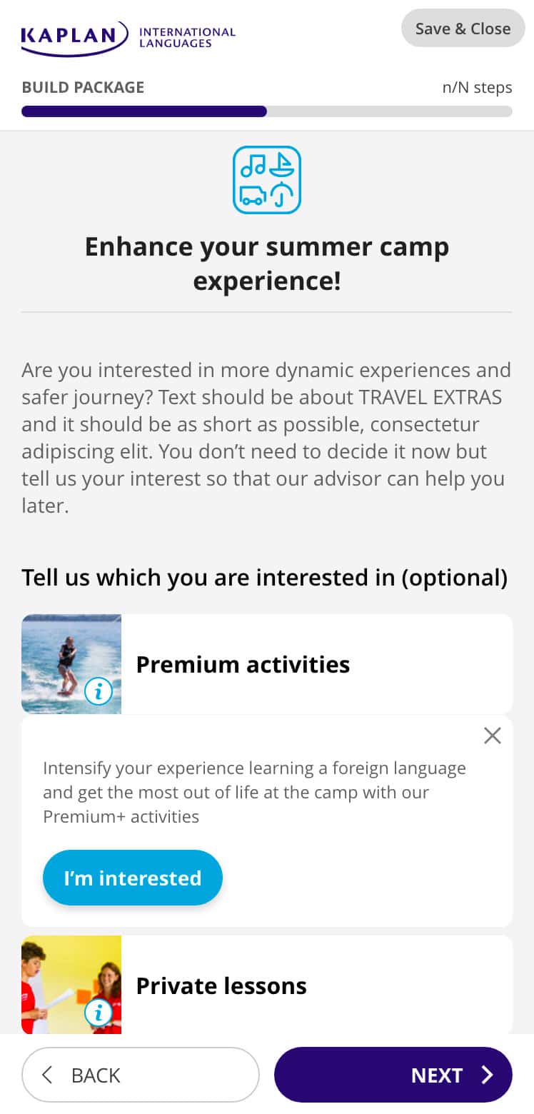
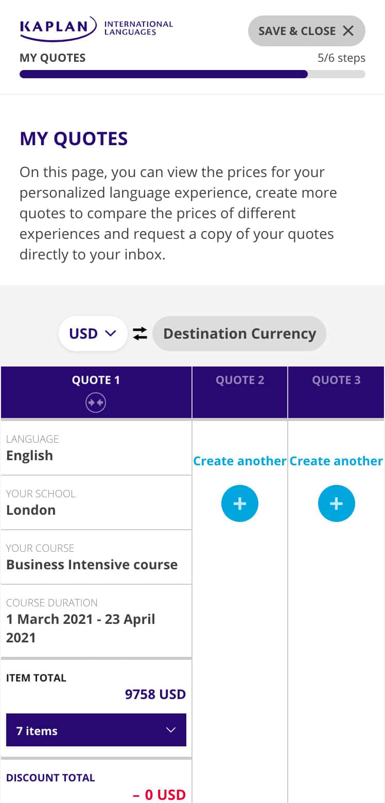
In 2020, Kaplan launched a new internal application, named Quote Tool and I led this application design. This enables our students to get instant quotes for our language programs. I focused on how users can get their quotes through the short steps and how user can reach to the stage of discussion with our sales team for their next journey. We surveyed our customer requirements, analysed the similar tools of our competitors, turned what we found into the user hypothesis. The quote tool is a really exciting foundation for our future as we move towards e-commerce capabilities for our students and agents. This application is still on the stage of experiment according to the MVP plan.

Style guidelines
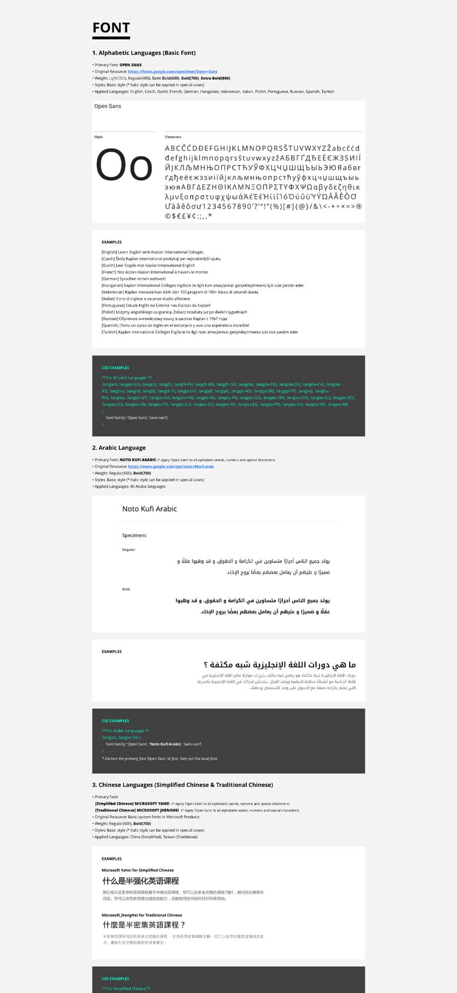
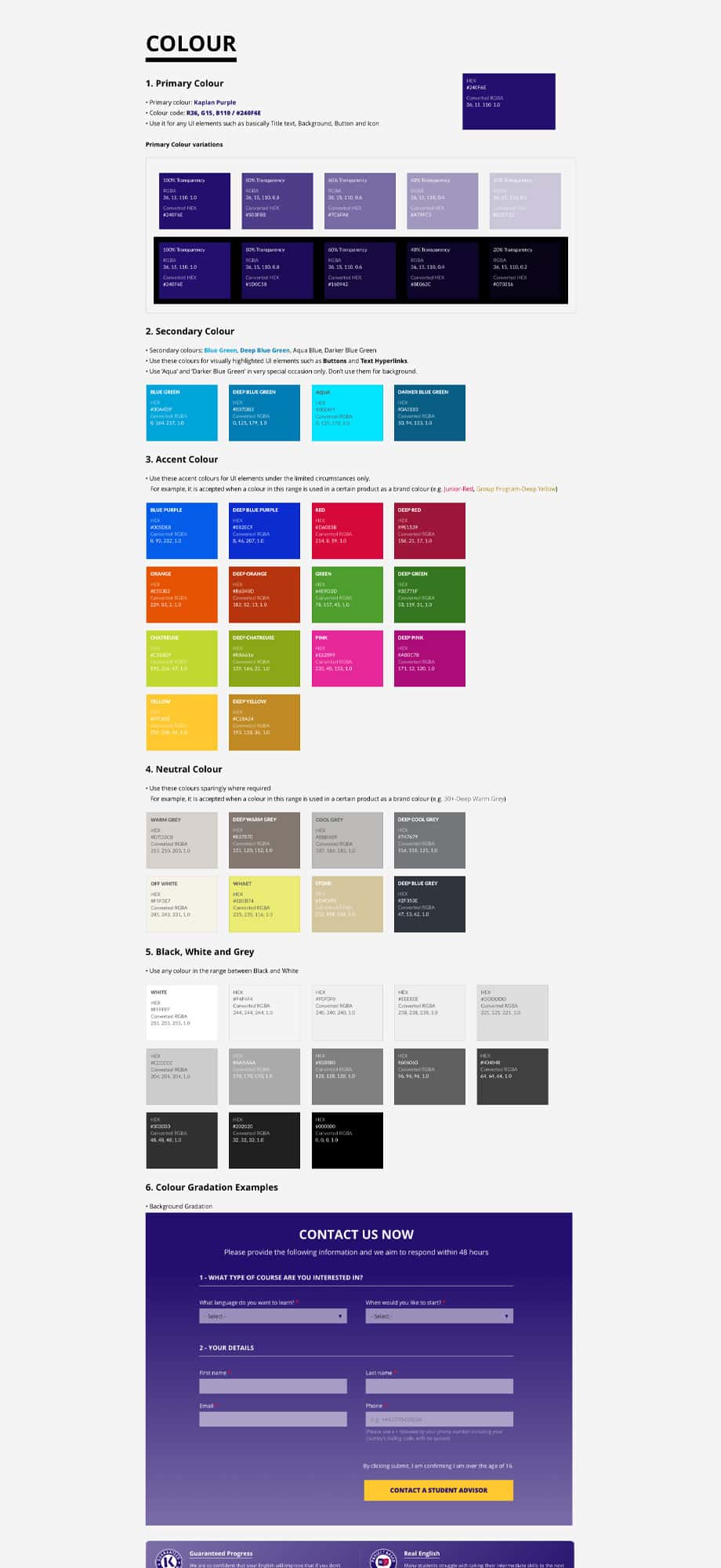
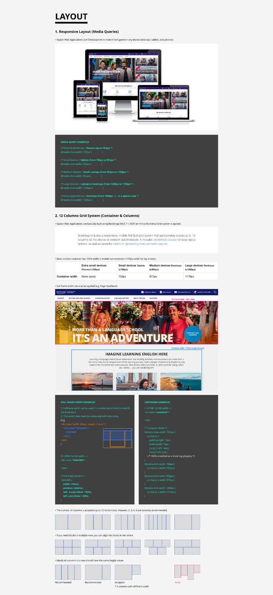
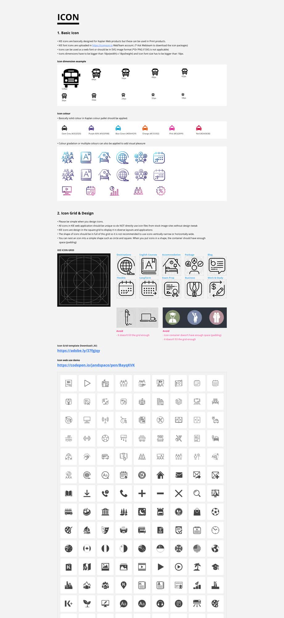
I developed product design manuals to ensure a consistent brand experience and to keep other designers to refer to.
These guidelines define all graphic elements in Kaplan’s digital applications and contain useful examples with practical front-end code so that designers and developers can work based on the same understanding.
Retrospective
This is what I felt and what I learned
User behavior patterns vary depending on the situation and purpose.
We have a lot of effort to increase usability and accessibility through enhanced search functions such as Course Finder, but not all users have shown great interest in this core features we are introducing. We are trying to improve this through constant testing with various possibilities. This is very natural, but I realized it once again.
Trust the findings more than inspiration
Creative ideas sound exciting, but they should be done on the basis of solid research. Many designers, including me, sometimes rely on their inspiration and hypothesis but it needs to be verified through research.
Think again, again and again
Experience designer is the closet to user. Designers should repeatedly question and consider whether their products meet the goals and interests of the majority of users because designers should be responsible for the products used by tens of thousands of people.


