


New digital products for EA, Extension Architecture
Extension Architecture is one of the leading Architecture & Planning Consultant practices in London. YKG Ltd owns the brand EA and contacted me to not only change the look and feel of EA brand but also redesign EA website.
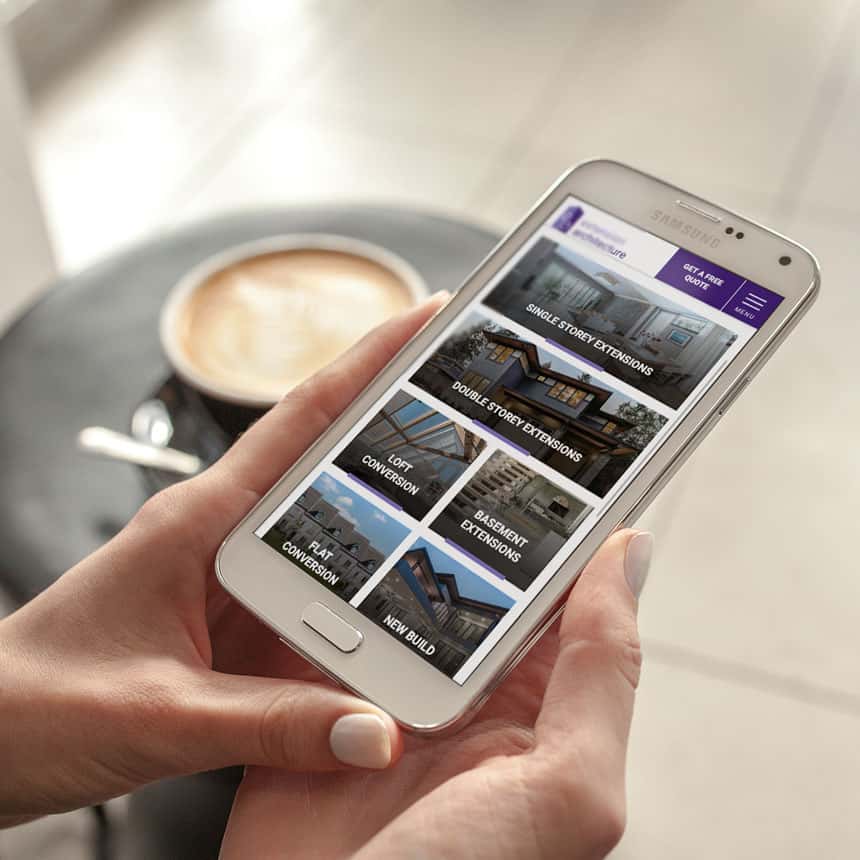
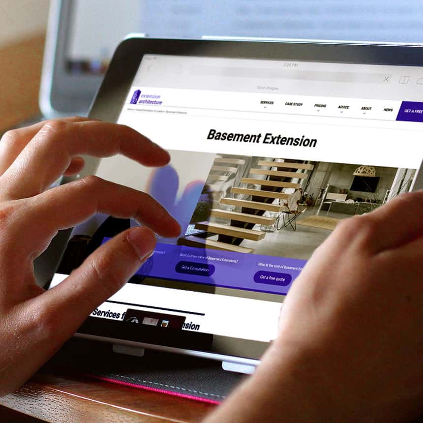
The main challenge was to come up with a new visual identity. EA already had a good logo shape in black and white but my idea was that it needs more vibrant colours and dynamic applications to appeal the EA brand a wider range of customers. Also it needed to develop new brand guidelines because the old one poorly explained the brand identity and its application. The brand had a website but it has lots of problems. The site was very partially responsive, did not appeal the brand identity enough, was poorly resolving user experience. Also the site needed to improve performance and speed.
I was involved in a multi-disciplinary team as a lead designer / developer to improve all these issues and this new brand and new website brought lots of improvement to the business. It definitely took EA's business a step further.
 My role

Project period

Client
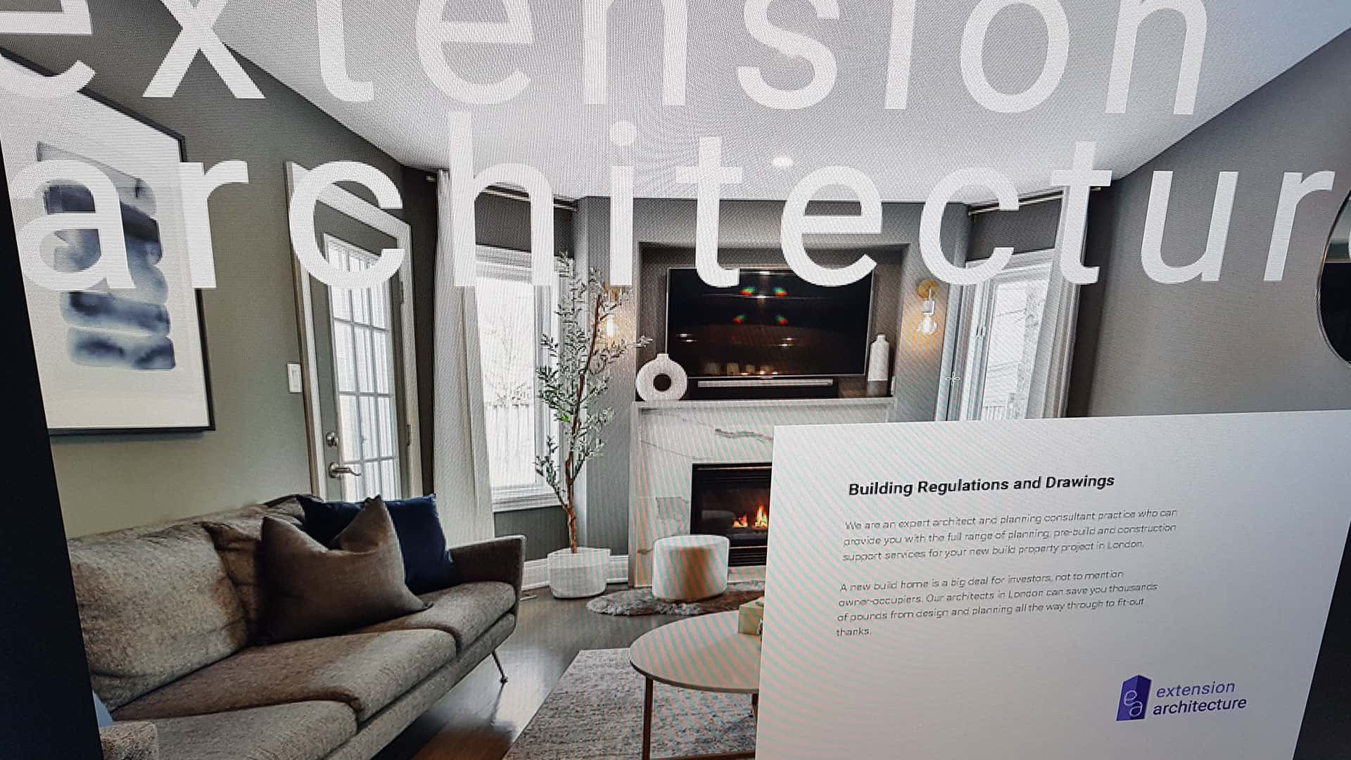
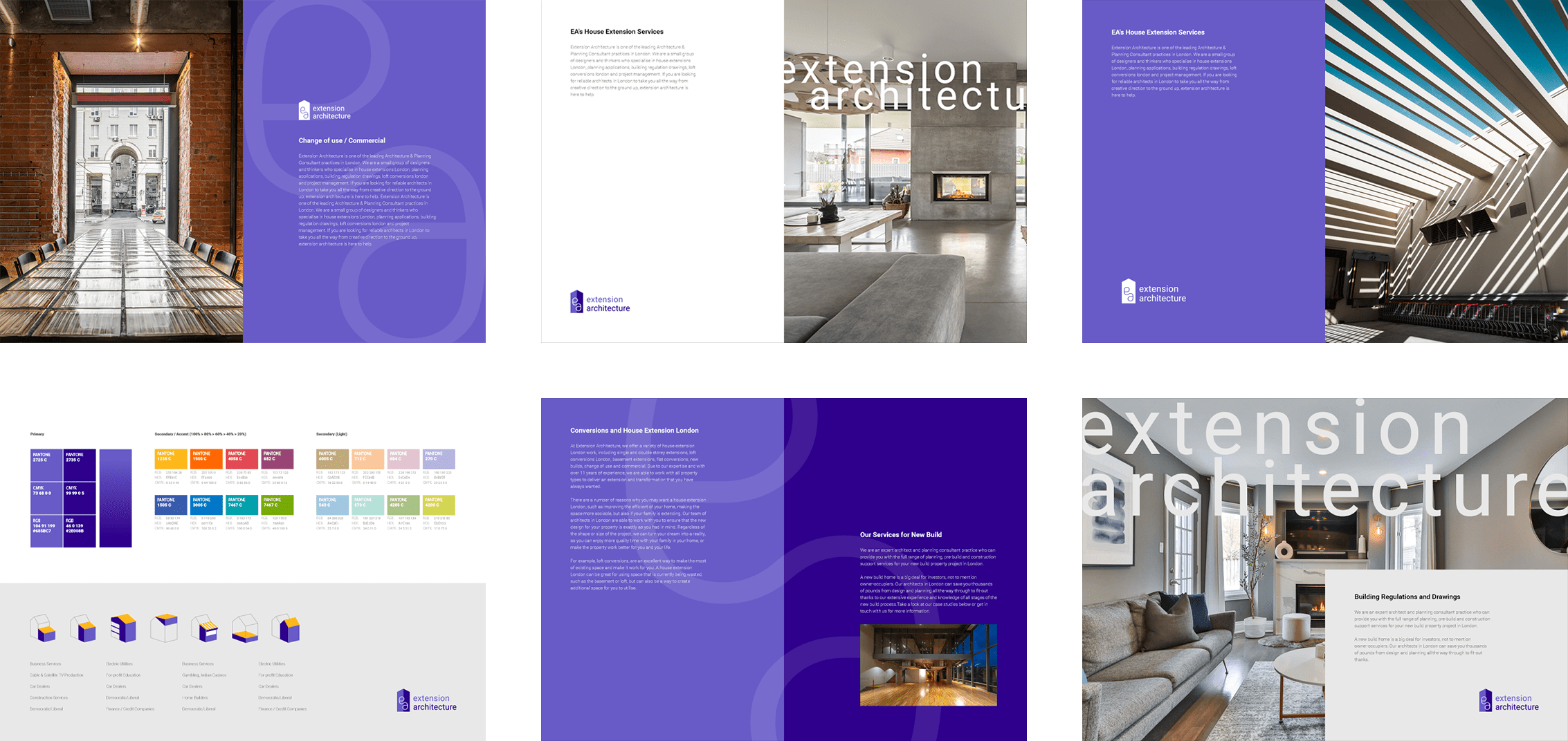
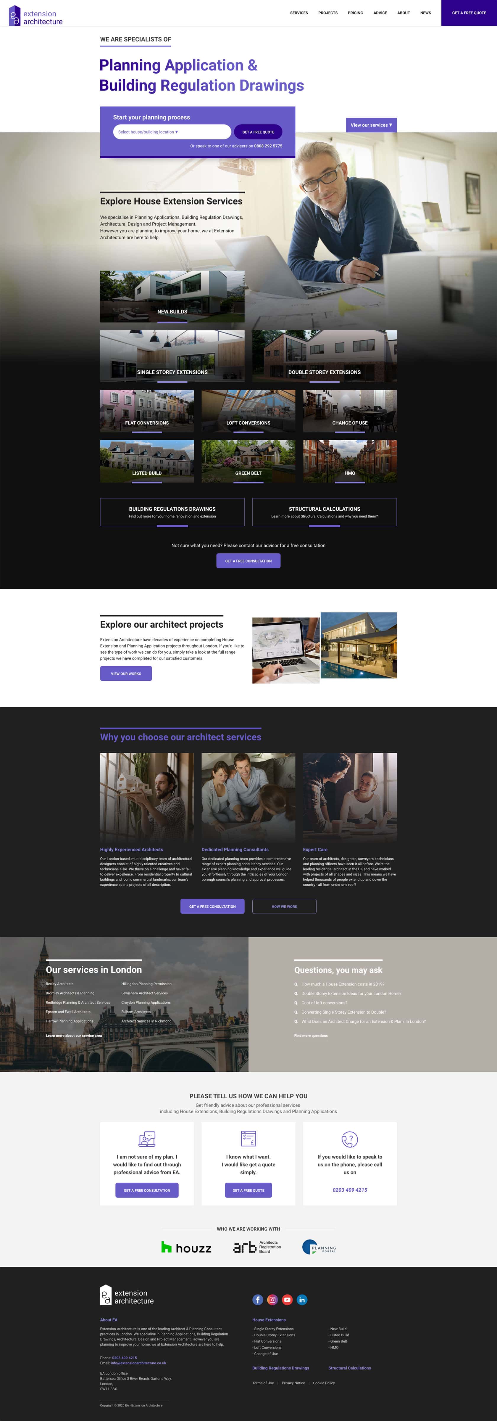
Brand Identity
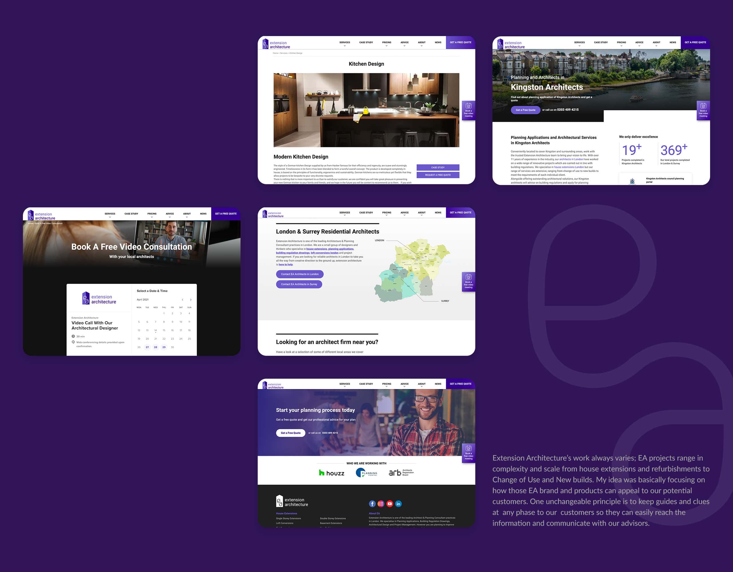
The visual language in EA brand should be able to be premium, confident and inspirational. The art direction needed to fit accordingly and to translate those core business values into the visual. Violet is a colour that creates a unique and fascinating atmosphere and is suitable for communicating our value to our customers. I improved the existing EA logo by reflecting what we researched and completed the visual identity of EA brand.
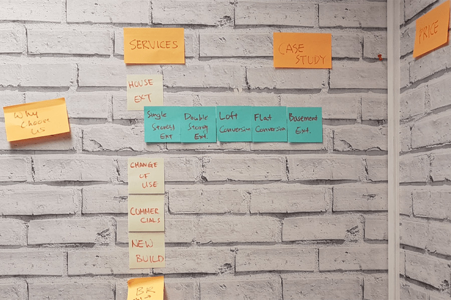
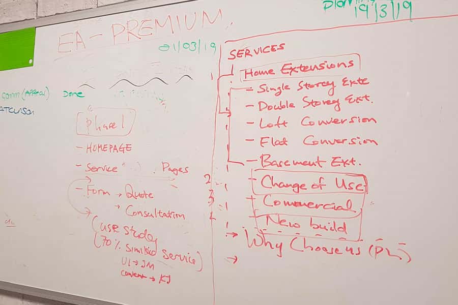
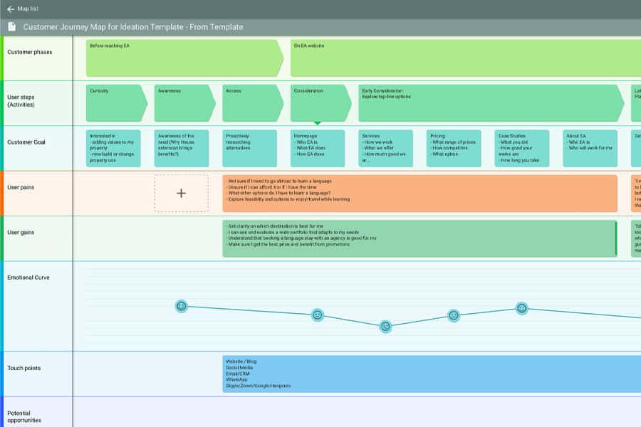
Brainstorming and customer journey
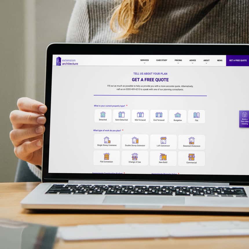
I carried out the design research for user experience with the team through such competitive analysis, persona building and card sorting. We tried to find out what our users expect in our new website and to find the balance between our main business goals and user needs. We categorised EA products and services by carrying out UX research and I defined persona user journey and site map. The major focus of this product involved simplifying the complex EA product categories and adding features without interrupting the experience of the existing users. Also the site has to be ready to give the answer on user questions at any phase. So I studied how the site provides the relevant information on every page and how easily induce our user to the question stage.
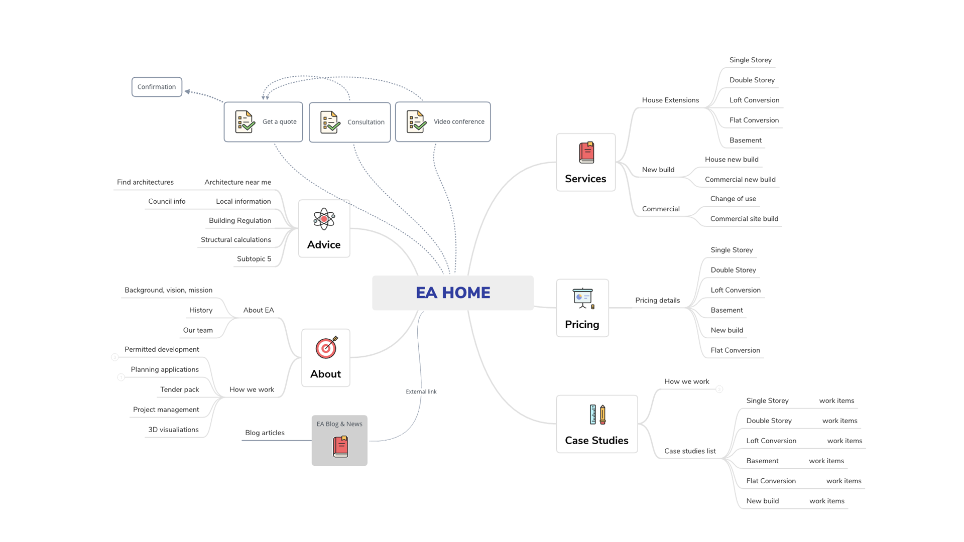
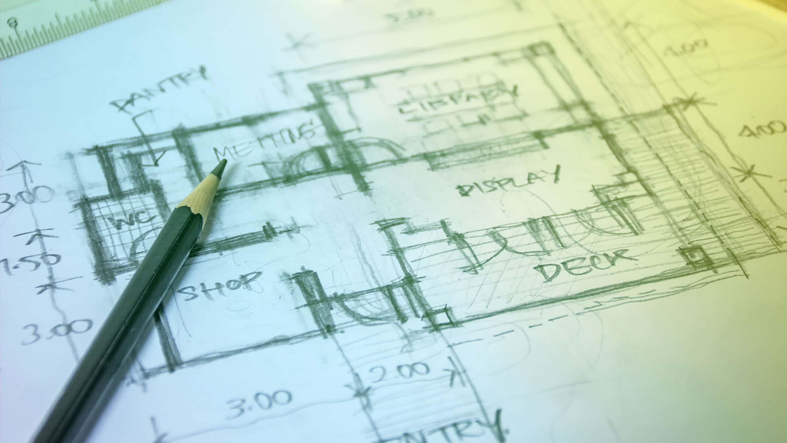
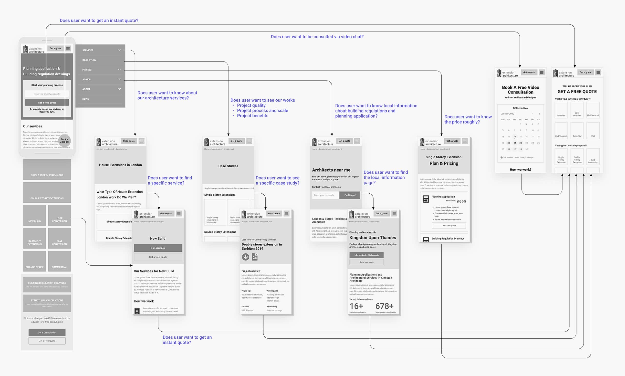
Wireframing
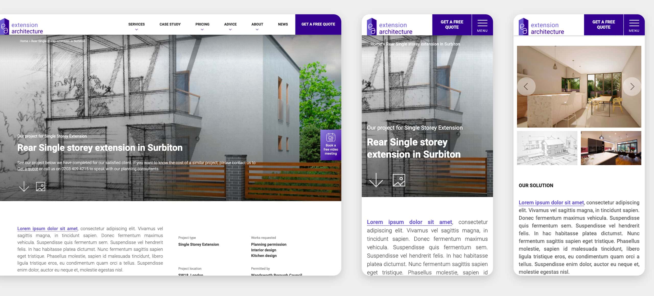
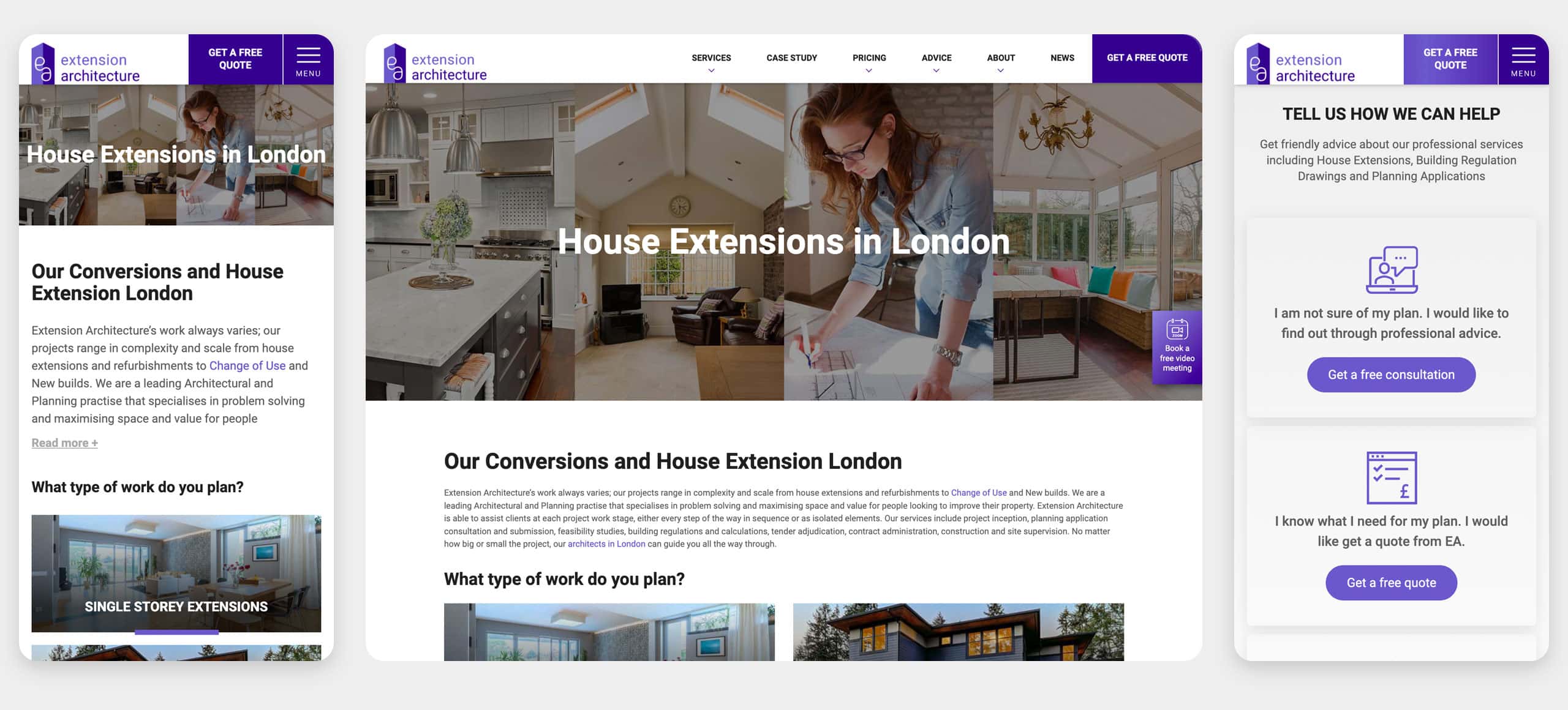
I defined important points through the entire wireframe process that outline the specific layouts, placement of page elements, site features, conversion areas and navigation for the website. To improve user experience and usability, we have identified flaws in the site architecture and how certain features work through a few wireframe works.
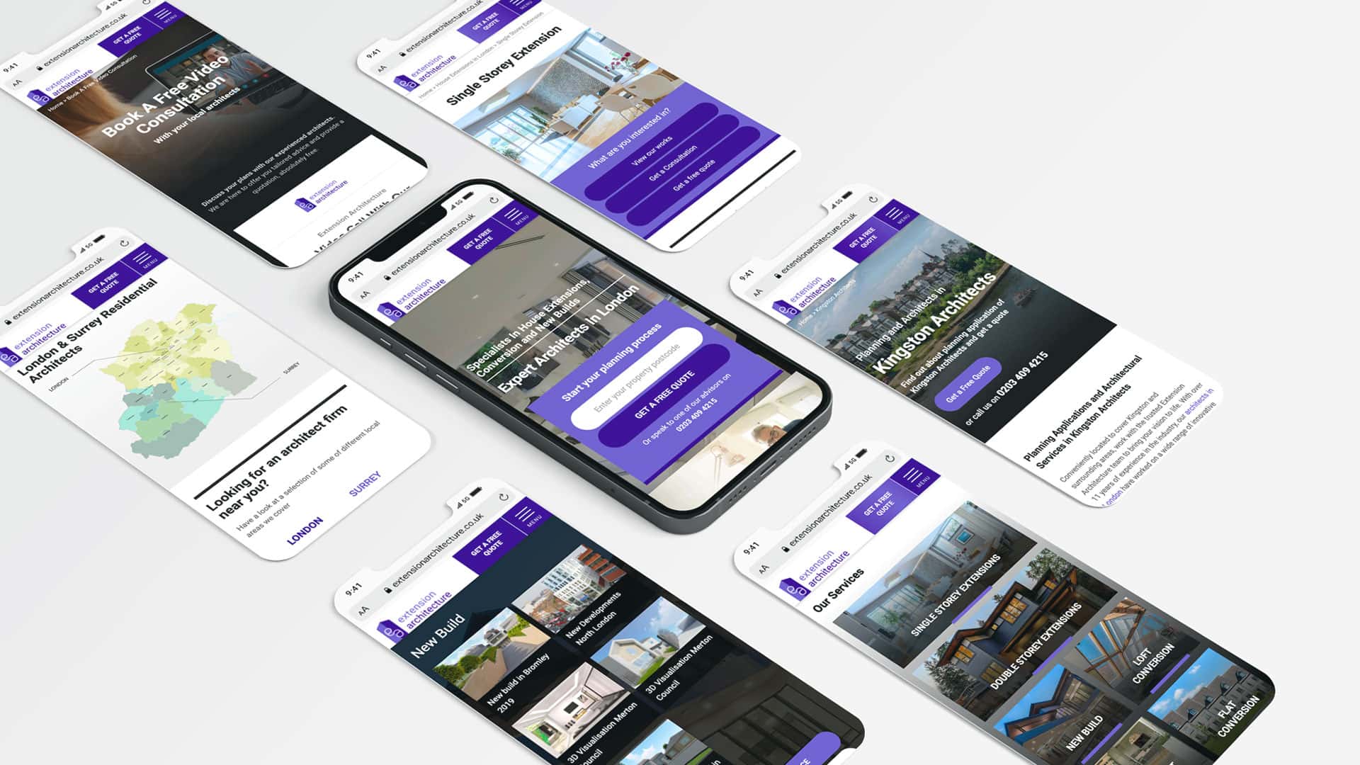
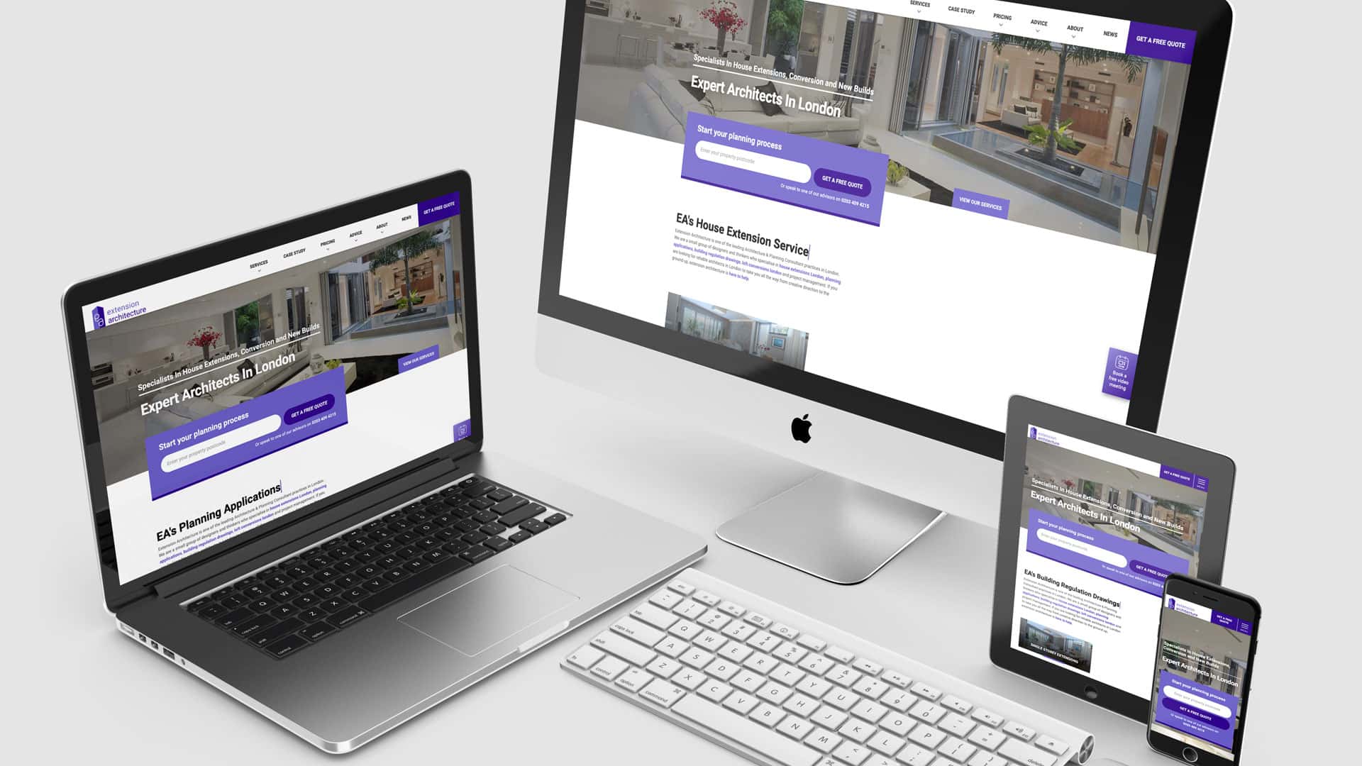
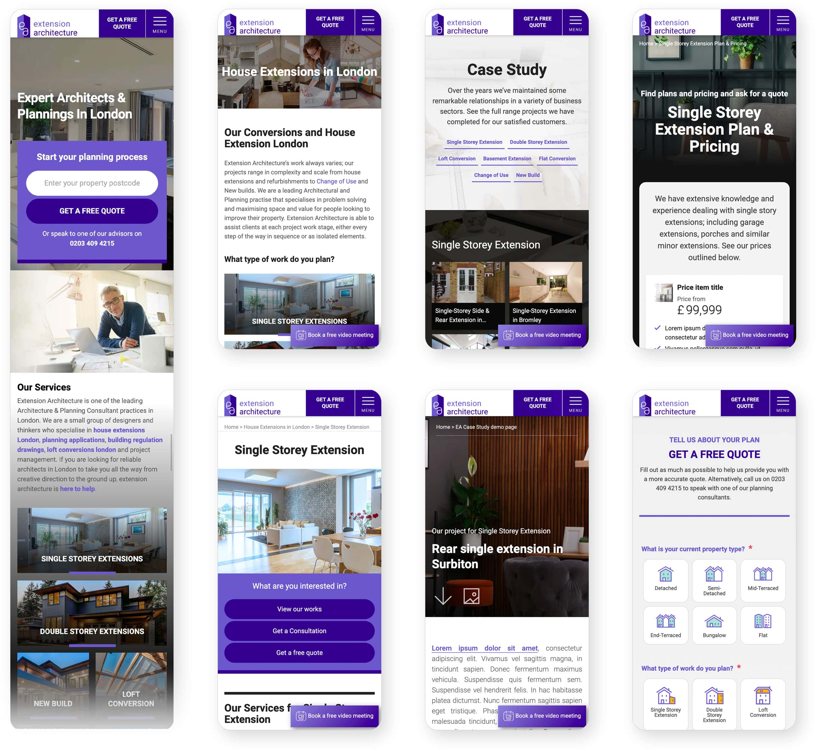
Visual design and prototyping
The first UI design principle is to focus on people As always. The site needs to provide lots of information to users so that they can understand EA architecture services but I tried to simplify the content and visual hierarchy and made highlights utilising visual elements such as fonts, colours and images where necessary. Also I needed to consider the website performance by putting the visual assets only as much as needed.
Retrospective
This is what I felt and what I learned
Constant debates for better UX
There are lots of trend lovers in the project and they wanted to add the newest web interactive skills to the website. I had to persuade them to understand that good design is not about trends but is built on the right user experience principles based on our target audience. In the course of the project, I made efforts to make them understand the purpose of this experience design.
Immediate good results
We have tested the site performance and monitored the conversion rate. The site attained average 25% conversion rate increase and great performance improvement (Mobile: 25%→60% / Desktop: 35%→85%, GTmetrix Grade A)