


User research / Visualisation / Frontend dev / Tutorial
View work
Excel to Kaplan PDF
User interview / Visualiation / Frontend dev / Tutorial


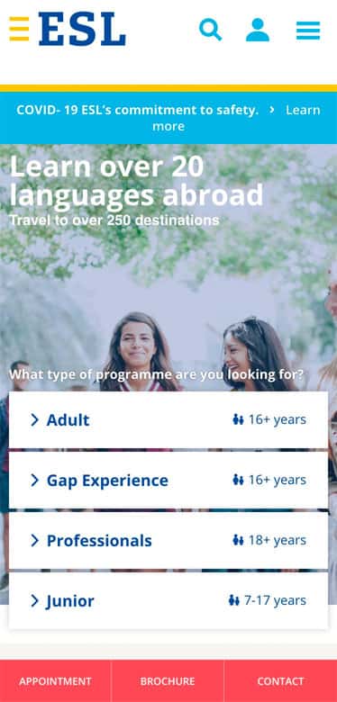
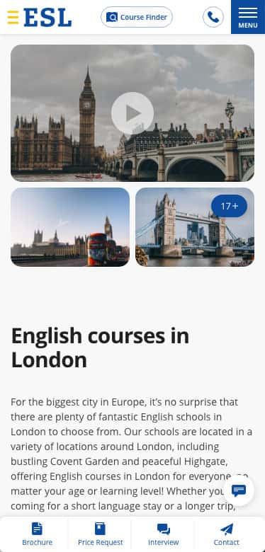
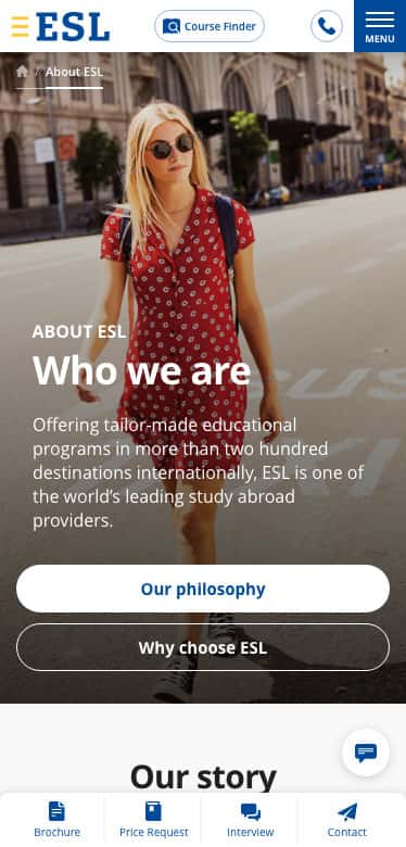
ESL Languages is one of the world’s leading study abroad providers.
Every aspect of this project was very enjoyable and dynamic and more than 15 of my co-workers were very passionate about this project too. I was a leading UX/UI designer to ensure the website is encouraging to any language learners who want to know all aspects of experience from improving language skills to staying abroad.
My work started from having discussions with Product owner and UX researchers, where we found problems with the current website and set up the right direction to make this new product more customer friendly and appealing. We also revamped the customer journey, product marketing funnels and sitemaps. I created low and hi fidelity wireframes and managed design systems so that I could guide the other designers. Finally I merged all design assets into the prototypes to communicate with developers.
 My role
 Project period
 Client
The most fundamental problem of the old website was that the users were on a very complex sitemap and so they could easily lose their way around the website. The old site’s user journey was only focused on language schools and destinations. However, we found that many users are concerned about which course fits their purpose prior to thinking about the destination. Furthermore, the search function was poor, even though the application contained more than hundreds of school items. In addition to this problem, there were other bigger and smaller issues.
To be the “booking.com” of the language travel industry offering the largest curated portfolio of language programs and driving 25% of ESL participants with direct online bookings by 2022.
To understand student needs, serve the right content (destinations, programs, schools and accommodation), inspire and guide them through the decision funnel to a direct booking or request of consultation.


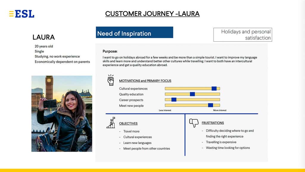
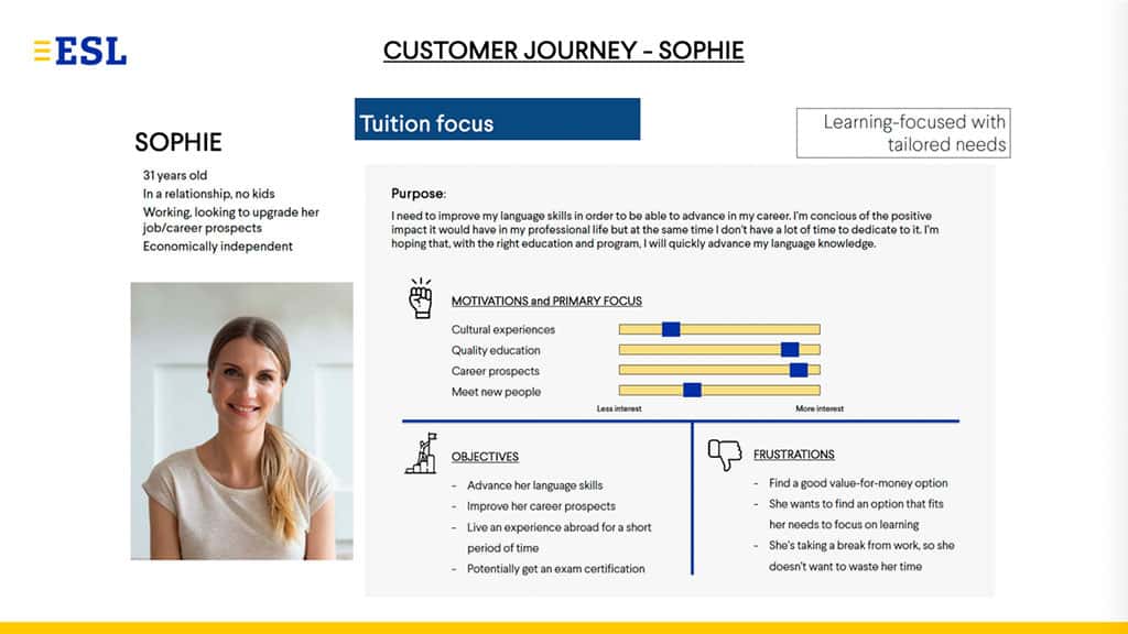
This step is to understand exactly what our users want to know and how we can draw it from them. We carried out user research and illustrated examples of customer journeys for our different personas. It became a good practice to build the master plan of a user journey.

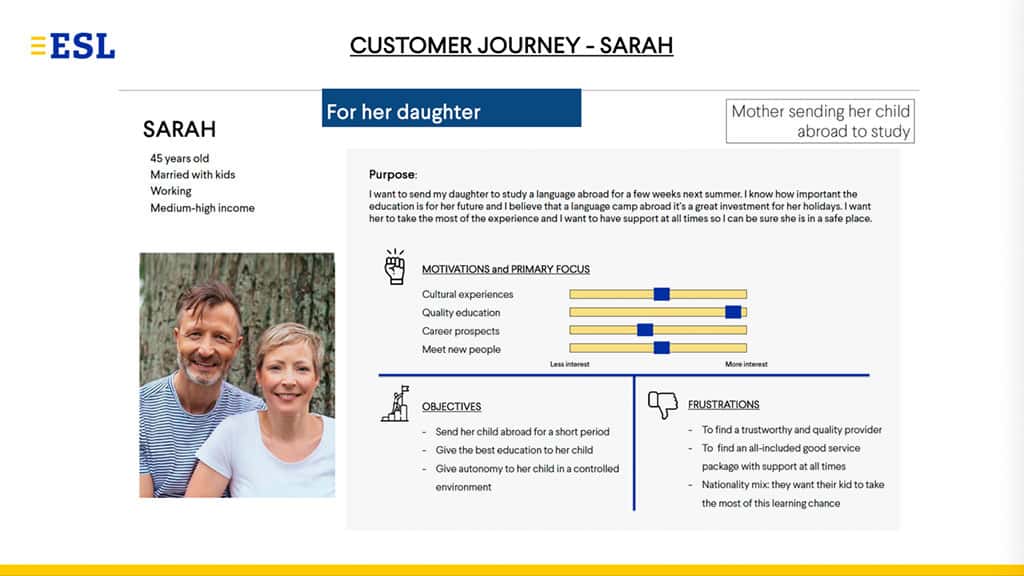
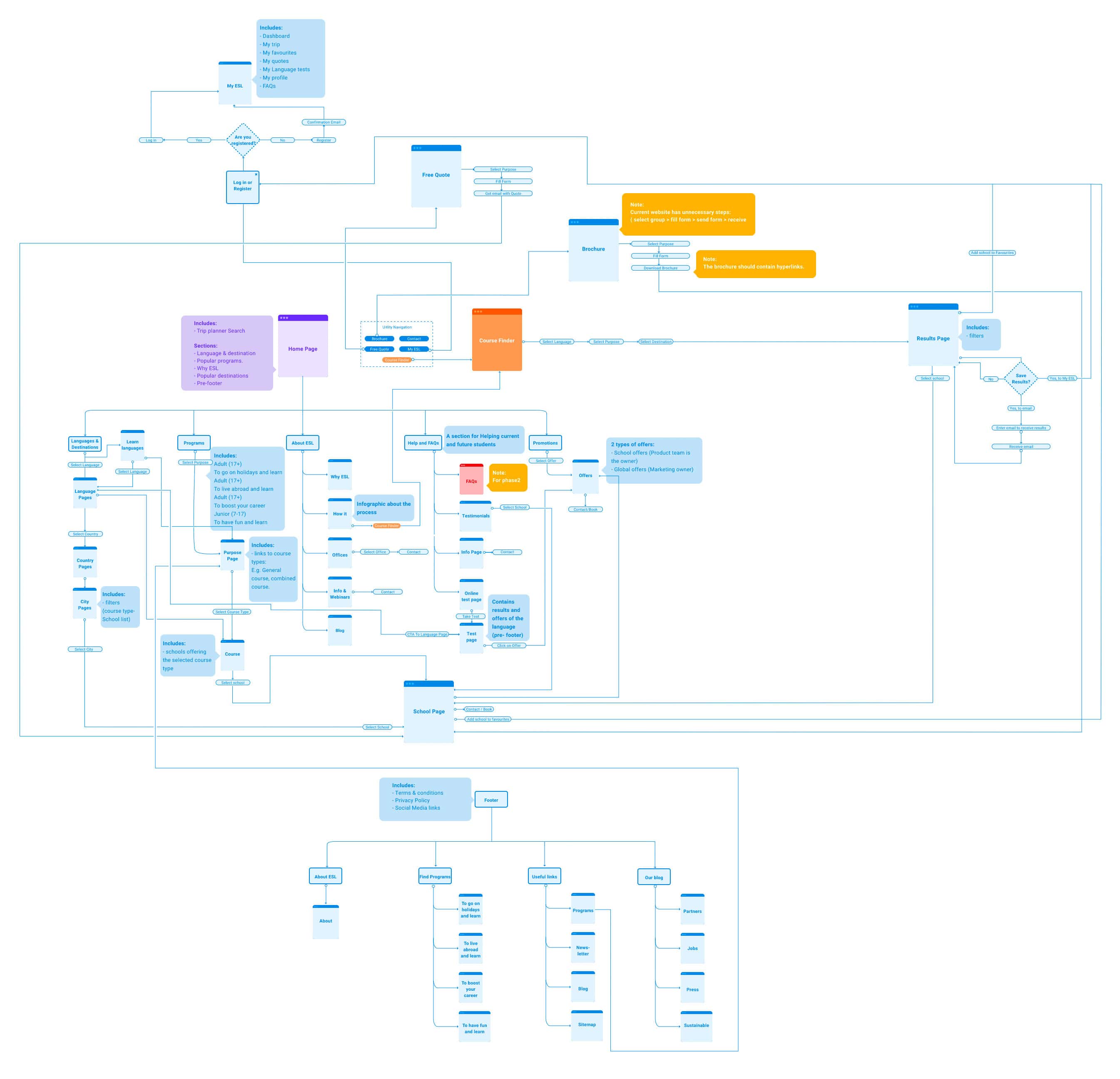
I sketched lo-fid wireframes based on what we found. We agreed that the new application needs to offer two paths for our customers so that they can easily find language courses and schools for their individual purposes. Also I mapped out user journey for users who want to find a school and course through traditional browsing.
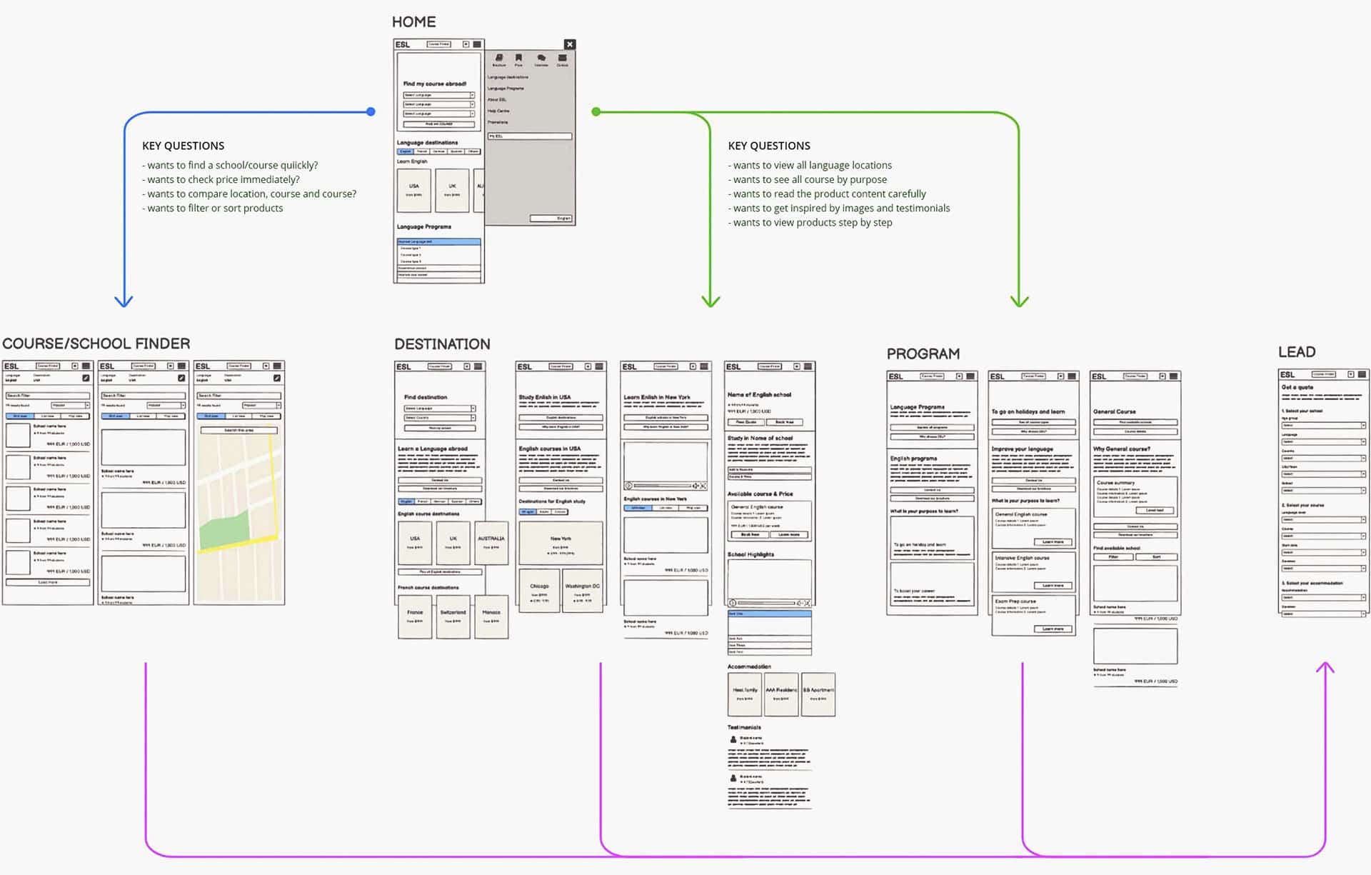
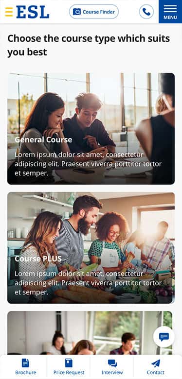
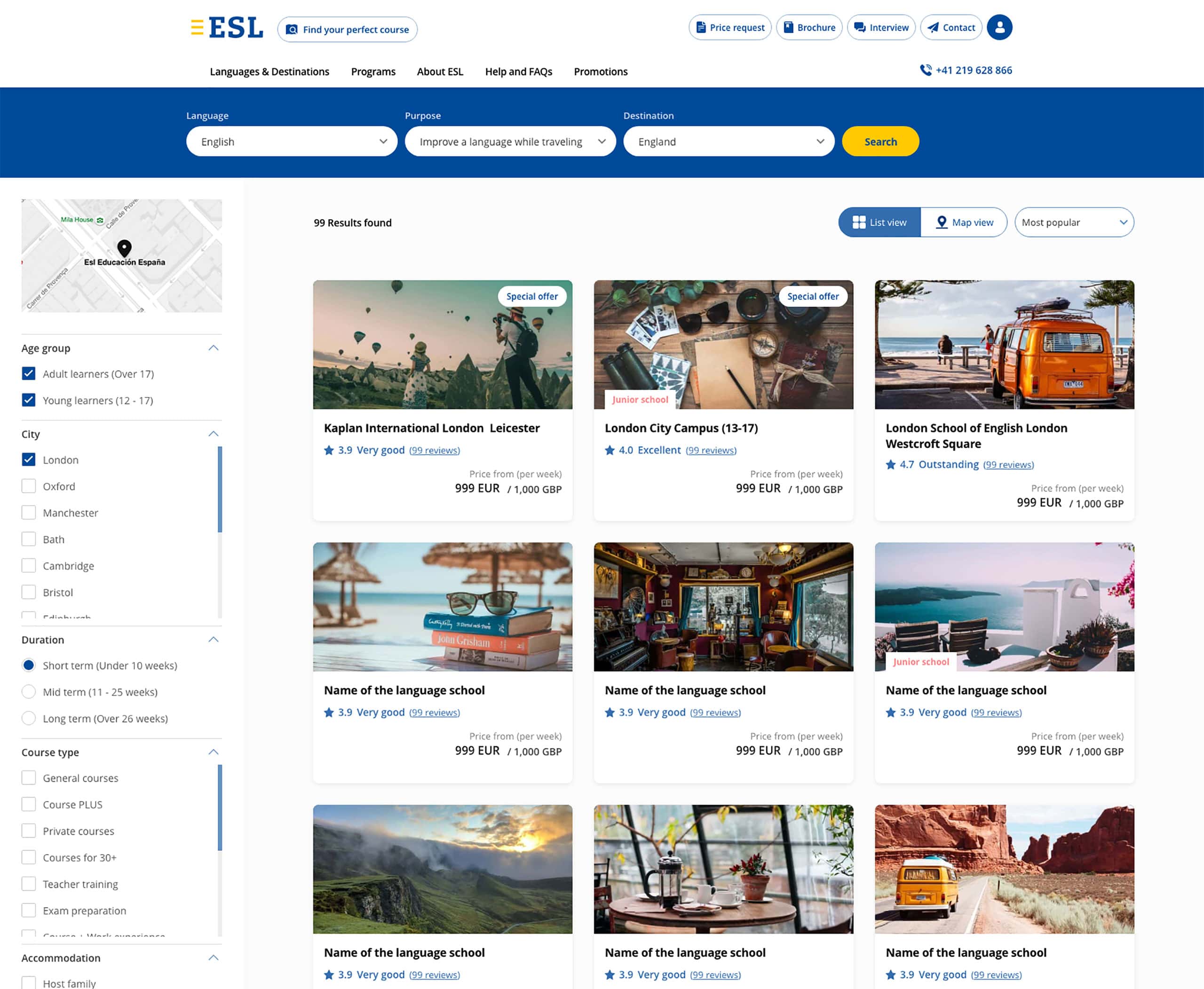
The search function should guide our user in the simplest way. It has to ask our customers a few basic questions about what language they want to learn, what their purpose is, and where they prefer to go so that it can present the most accurate result of schools and courses.
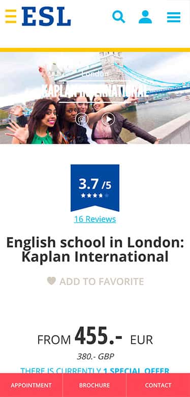
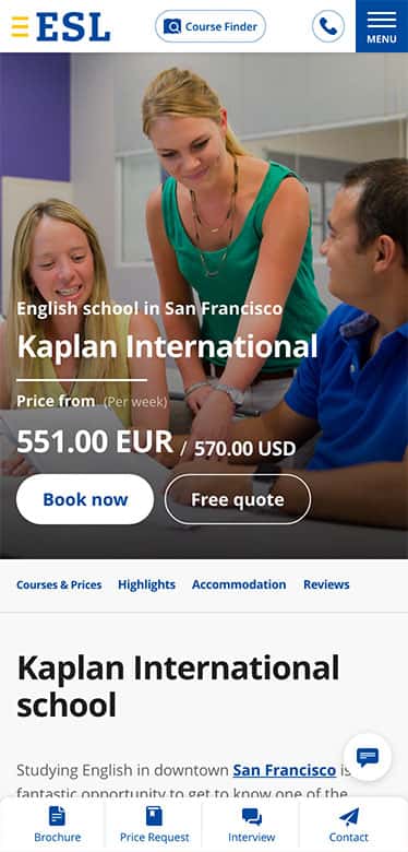
Overall, more than 50% of ESL customers visit the website using their mobile phone. It is very important to communicate with our visitors on mobiles. I started developing wireframes and mockups for mobiles, after predicting user behaviour on mobiles and considering how to effectively appeal ESL programs on the users' mobile phone. I also haven't forgot to consider the design on other extended devices.

All design guidelines and components were defined along visual communication principles of ESL and formed the foundation of accessibility, usability and modular design elements. I planned guideline structure and created basic style guidelines/component manuals so that other designers can develop further on the foundation. The component manuals not only made overall communication easier, but also made collaboration between designers and developers more active and effective.

This is what I felt and what I learned
More research more clues
ESL UX experts carried out lots of user research. The vast amount of research data has helped me define hypotheses about potential behaviour of users and design flow and maps for the new project.
Consider all parts
Designers and product owners should propose visual communication ideas whilst considering all aspects of whether they are consistent with the current data assets that we have and they are technically feasible by developers to implement within the planned timeline. We resolved these issues by splitting projects according to our MVP planning.
Under Covid-19 ...
Due to Covid 19, all members had to work remotely. It was a big benefit for me to concentrate on what I am working on, meanwhile I realised that it might cause communication problems than when we talk together in the same room.